Lay out and drive a basic I/O widget
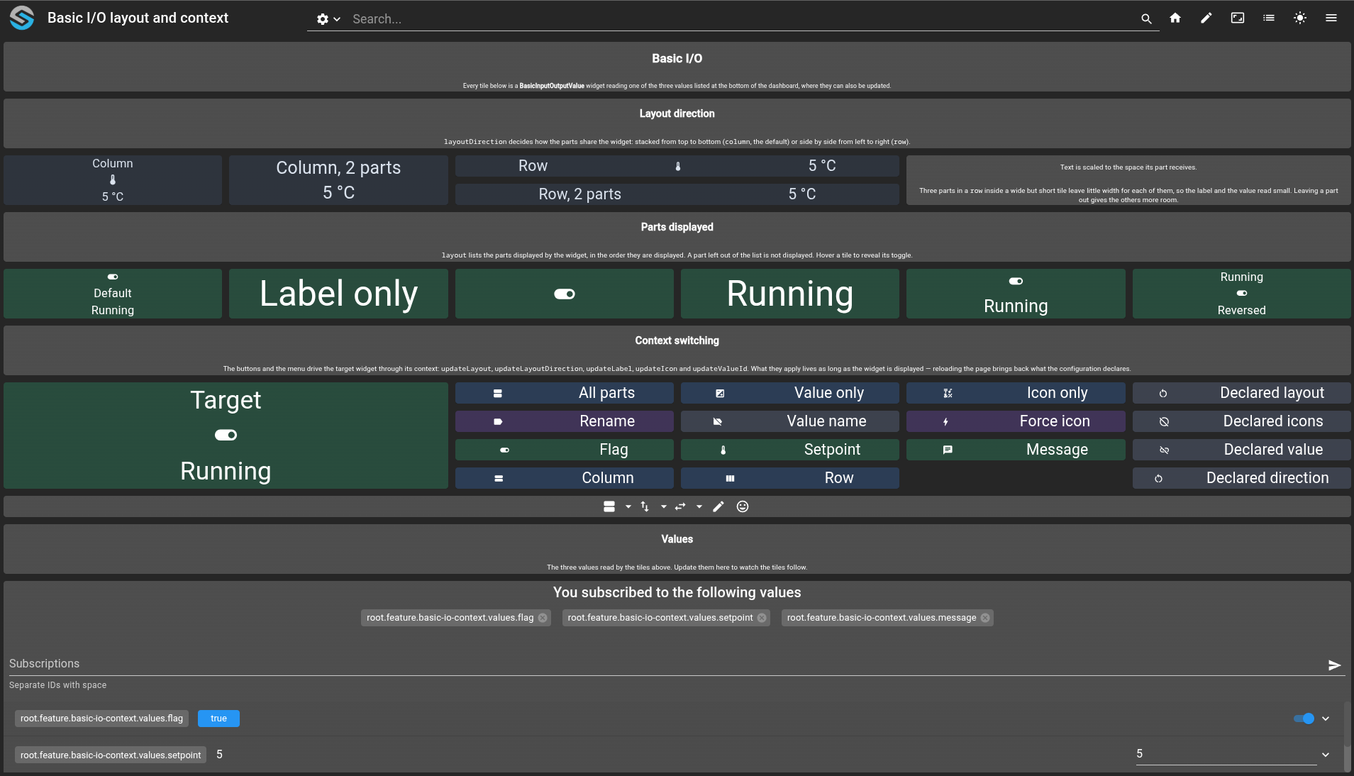
This tutorial covers how a basic I/O widget is arranged and how it is driven once displayed. The dashboard reads the same three values through a dozen tiles, so each parameter can be compared side by side.
Decide how the parts share the widget with
layoutDirection.Decide which parts a widget displays, and in which order, with
layout.Change the label, the icon, the parts, the direction and the value of a widget while it is displayed, through its widget context.
Drive that context from the
onClickhandler of another widget and from a menu.
git checkout origin/osp-web-configuration .
git checkout origin/osp-variables-configuration .
git checkout origin/example-dashboard-basic-io-widget .
Prerequisites
Steps
Create the three values
The dashboard reads one value per type, so the same widget can be pointed at a boolean, an integer and a text value in turn.
root/feature/basic-io-context/values/flag/value.ospp
{
    "name": "Basic I/O flag",
    "description": "Boolean value displayed by the basic I/O showcase",
    "type": "BOOLEAN"
}
root/feature/basic-io-context/values/flag/owner.variables
{
    "moduleId": "modules.variables.variables-1"
}
root/feature/basic-io-context/values/setpoint/value.ospp
{
    "name": "Basic I/O setpoint",
    "description": "Integer value displayed by the basic I/O showcase",
    "type": "INTEGER"
}
root/feature/basic-io-context/values/message/value.ospp
{
    "name": "Basic I/O message",
    "description": "Text value displayed by the basic I/O showcase",
    "type": "TEXT"
}
The setpoint and message values each need an owner.variables file next to their value.ospp, with the same content as the one above.
Create the dashboard
Every tile of the dashboard is a BasicInputOutputValue widget. A Markdown widget introduces each group, and a ValueSubscription widget at the bottom updates the three values so the tiles can be watched reacting.
root/feature/basic-io-context/dashboard/dashboard.web
{
    "moduleId": "modules.web.web-1",
    "title": "Basic I/O layout and context",
    "description": "Layout direction, parts displayed and runtime context switching of the basic I/O widget",
    "folders": ["Dev"],
    "tags": ["Dashboard", "I/O", "Basic I/O"]
}
root/feature/basic-io-context/dashboard/dashboard.view
Every tile follows the shape of the first one below: a type, the settings that lay it out and the value it subscribes to.
Show the whole dashboard.view
1{
2 "configuration": [
3 {
4 "type": "Markdown",
5 "id": "md-title",
6 "markdownWidgetSettings": {
7 "markdown": "# Basic I/O\nEvery tile below is a **BasicInputOutputValue** widget reading one of the three values listed at the bottom of the dashboard, where they can also be updated."
8 },
9 "title": ""
10 },
11 {
12 "type": "Markdown",
13 "id": "md-direction",
14 "markdownWidgetSettings": {
15 "markdown": "## Layout direction\n`layoutDirection` decides how the parts share the widget: stacked from top to bottom (`column`, the default) or side by side from left to right (`row`)."
16 },
17 "title": ""
18 },
19 {
20 "type": "BasicInputOutputValue",
21 "basicWidgetSettings": {
22 "backgroundColor": {
23 "light": "#f0f3f7",
24 "dark": "#1e2430"
25 },
26 "foregroundColor": {
27 "light": "#1b2f4b",
28 "dark": "#dbe3ee"
29 },
30 "icon": "thermostat",
31 "label": "Column",
32 "layout": [
33 "label",
34 "icon",
35 "value"
36 ],
37 "layoutDirection": "column",
38 "showTooltip": true,
39 "tooltip": "layout: label, icon, value — layoutDirection: column",
40 "unknownIcon": "help_outline",
41 "unknownValueText": "Unknown",
42 "variableText": "%d °C"
43 },
44 "id": "dir-column-3",
45 "title": "",
46 "valueSubscriptions": {
47 "values": [
48 {
49 "id": "root.feature.basic-io-context.values.setpoint",
50 "right": "READ",
51 "type": "INTEGER"
52 }
53 ]
54 }
55 },
56 {
57 "type": "BasicInputOutputValue",
58 "basicWidgetSettings": {
59 "backgroundColor": {
60 "light": "#f0f3f7",
61 "dark": "#1e2430"
62 },
63 "foregroundColor": {
64 "light": "#1b2f4b",
65 "dark": "#dbe3ee"
66 },
67 "icon": "thermostat",
68 "label": "Column, 2 parts",
69 "layout": [
70 "label",
71 "value"
72 ],
73 "layoutDirection": "column",
74 "showTooltip": true,
75 "tooltip": "layout: label, value — layoutDirection: column",
76 "unknownIcon": "help_outline",
77 "unknownValueText": "Unknown",
78 "variableText": "%d °C"
79 },
80 "id": "dir-column-2",
81 "title": "",
82 "valueSubscriptions": {
83 "values": [
84 {
85 "id": "root.feature.basic-io-context.values.setpoint",
86 "right": "READ",
87 "type": "INTEGER"
88 }
89 ]
90 }
91 },
92 {
93 "type": "BasicInputOutputValue",
94 "basicWidgetSettings": {
95 "backgroundColor": {
96 "light": "#f0f3f7",
97 "dark": "#1e2430"
98 },
99 "foregroundColor": {
100 "light": "#1b2f4b",
101 "dark": "#dbe3ee"
102 },
103 "icon": "thermostat",
104 "label": "Row",
105 "layout": [
106 "label",
107 "icon",
108 "value"
109 ],
110 "layoutDirection": "row",
111 "showTooltip": true,
112 "tooltip": "layout: label, icon, value — layoutDirection: row",
113 "unknownIcon": "help_outline",
114 "unknownValueText": "Unknown",
115 "variableText": "%d °C"
116 },
117 "id": "dir-row-3",
118 "title": "",
119 "valueSubscriptions": {
120 "values": [
121 {
122 "id": "root.feature.basic-io-context.values.setpoint",
123 "right": "READ",
124 "type": "INTEGER"
125 }
126 ]
127 }
128 },
129 {
130 "type": "BasicInputOutputValue",
131 "basicWidgetSettings": {
132 "backgroundColor": {
133 "light": "#f0f3f7",
134 "dark": "#1e2430"
135 },
136 "foregroundColor": {
137 "light": "#1b2f4b",
138 "dark": "#dbe3ee"
139 },
140 "icon": "thermostat",
141 "label": "Row, 2 parts",
142 "layout": [
143 "label",
144 "value"
145 ],
146 "layoutDirection": "row",
147 "showTooltip": true,
148 "tooltip": "layout: label, value — layoutDirection: row",
149 "unknownIcon": "help_outline",
150 "unknownValueText": "Unknown",
151 "variableText": "%d °C"
152 },
153 "id": "dir-row-2",
154 "title": "",
155 "valueSubscriptions": {
156 "values": [
157 {
158 "id": "root.feature.basic-io-context.values.setpoint",
159 "right": "READ",
160 "type": "INTEGER"
161 }
162 ]
163 }
164 },
165 {
166 "type": "Markdown",
167 "id": "md-direction-note",
168 "markdownWidgetSettings": {
169 "markdown": "Text is scaled to the space its part receives.\n\nThree parts in a `row` inside a wide but short tile leave little width for each of them, so the label and the value read small. Leaving a part out gives the others more room."
170 },
171 "title": ""
172 },
173 {
174 "type": "Markdown",
175 "id": "md-parts",
176 "markdownWidgetSettings": {
177 "markdown": "## Parts displayed\n`layout` lists the parts displayed by the widget, in the order they are displayed. A part left out of the list is not displayed. Hover a tile to reveal its toggle."
178 },
179 "title": ""
180 },
181 {
182 "type": "BasicInputOutputValue",
183 "basicWidgetSettings": {
184 "foregroundColor": "#FFFFFF",
185 "label": "Default",
186 "layout": [
187 "icon",
188 "label",
189 "value"
190 ],
191 "layoutDirection": "column",
192 "offBackgroundColor": {
193 "light": "#7d8899",
194 "dark": "#2f3542"
195 },
196 "offIcon": "toggle_off",
197 "offValueText": "Idle",
198 "onBackgroundColor": {
199 "light": "#2f8f6b",
200 "dark": "#17402f"
201 },
202 "onIcon": "toggle_on",
203 "onValueText": "Running",
204 "showTooltip": true,
205 "tooltip": "No layout declared: the default icon, label then value applies",
206 "unknownBackgroundColor": {
207 "light": "#c98a2e",
208 "dark": "#4a3418"
209 },
210 "unknownIcon": "help_outline",
211 "unknownValueText": "Unknown"
212 },
213 "id": "parts-default",
214 "title": "",
215 "valueSubscriptions": {
216 "values": [
217 {
218 "id": "root.feature.basic-io-context.values.flag",
219 "right": "READ_WRITE",
220 "type": "BOOLEAN"
221 }
222 ]
223 }
224 },
225 {
226 "type": "BasicInputOutputValue",
227 "basicWidgetSettings": {
228 "foregroundColor": "#FFFFFF",
229 "label": "Label only",
230 "layout": [
231 "label"
232 ],
233 "layoutDirection": "column",
234 "offBackgroundColor": {
235 "light": "#7d8899",
236 "dark": "#2f3542"
237 },
238 "offIcon": "toggle_off",
239 "offValueText": "Idle",
240 "onBackgroundColor": {
241 "light": "#2f8f6b",
242 "dark": "#17402f"
243 },
244 "onIcon": "toggle_on",
245 "onValueText": "Running",
246 "showTooltip": true,
247 "tooltip": "layout: label",
248 "unknownBackgroundColor": {
249 "light": "#c98a2e",
250 "dark": "#4a3418"
251 },
252 "unknownIcon": "help_outline",
253 "unknownValueText": "Unknown"
254 },
255 "id": "parts-label",
256 "title": "",
257 "valueSubscriptions": {
258 "values": [
259 {
260 "id": "root.feature.basic-io-context.values.flag",
261 "right": "READ_WRITE",
262 "type": "BOOLEAN"
263 }
264 ]
265 }
266 },
267 {
268 "type": "BasicInputOutputValue",
269 "basicWidgetSettings": {
270 "foregroundColor": "#FFFFFF",
271 "label": "Icon only",
272 "layout": [
273 "icon"
274 ],
275 "layoutDirection": "column",
276 "offBackgroundColor": {
277 "light": "#7d8899",
278 "dark": "#2f3542"
279 },
280 "offIcon": "toggle_off",
281 "offValueText": "Idle",
282 "onBackgroundColor": {
283 "light": "#2f8f6b",
284 "dark": "#17402f"
285 },
286 "onIcon": "toggle_on",
287 "onValueText": "Running",
288 "showTooltip": true,
289 "tooltip": "layout: icon",
290 "unknownBackgroundColor": {
291 "light": "#c98a2e",
292 "dark": "#4a3418"
293 },
294 "unknownIcon": "help_outline",
295 "unknownValueText": "Unknown"
296 },
297 "id": "parts-icon",
298 "title": "",
299 "valueSubscriptions": {
300 "values": [
301 {
302 "id": "root.feature.basic-io-context.values.flag",
303 "right": "READ_WRITE",
304 "type": "BOOLEAN"
305 }
306 ]
307 }
308 },
309 {
310 "type": "BasicInputOutputValue",
311 "basicWidgetSettings": {
312 "foregroundColor": "#FFFFFF",
313 "label": "Value only",
314 "layout": [
315 "value"
316 ],
317 "layoutDirection": "column",
318 "offBackgroundColor": {
319 "light": "#7d8899",
320 "dark": "#2f3542"
321 },
322 "offIcon": "toggle_off",
323 "offValueText": "Idle",
324 "onBackgroundColor": {
325 "light": "#2f8f6b",
326 "dark": "#17402f"
327 },
328 "onIcon": "toggle_on",
329 "onValueText": "Running",
330 "showTooltip": true,
331 "tooltip": "layout: value",
332 "unknownBackgroundColor": {
333 "light": "#c98a2e",
334 "dark": "#4a3418"
335 },
336 "unknownIcon": "help_outline",
337 "unknownValueText": "Unknown"
338 },
339 "id": "parts-value",
340 "title": "",
341 "valueSubscriptions": {
342 "values": [
343 {
344 "id": "root.feature.basic-io-context.values.flag",
345 "right": "READ_WRITE",
346 "type": "BOOLEAN"
347 }
348 ]
349 }
350 },
351 {
352 "type": "BasicInputOutputValue",
353 "basicWidgetSettings": {
354 "foregroundColor": "#FFFFFF",
355 "label": "Icon and value",
356 "layout": [
357 "icon",
358 "value"
359 ],
360 "layoutDirection": "column",
361 "offBackgroundColor": {
362 "light": "#7d8899",
363 "dark": "#2f3542"
364 },
365 "offIcon": "toggle_off",
366 "offValueText": "Idle",
367 "onBackgroundColor": {
368 "light": "#2f8f6b",
369 "dark": "#17402f"
370 },
371 "onIcon": "toggle_on",
372 "onValueText": "Running",
373 "showTooltip": true,
374 "tooltip": "layout: icon, value",
375 "unknownBackgroundColor": {
376 "light": "#c98a2e",
377 "dark": "#4a3418"
378 },
379 "unknownIcon": "help_outline",
380 "unknownValueText": "Unknown"
381 },
382 "id": "parts-icon-value",
383 "title": "",
384 "valueSubscriptions": {
385 "values": [
386 {
387 "id": "root.feature.basic-io-context.values.flag",
388 "right": "READ_WRITE",
389 "type": "BOOLEAN"
390 }
391 ]
392 }
393 },
394 {
395 "type": "BasicInputOutputValue",
396 "basicWidgetSettings": {
397 "foregroundColor": "#FFFFFF",
398 "label": "Reversed",
399 "layout": [
400 "value",
401 "icon",
402 "label"
403 ],
404 "layoutDirection": "column",
405 "offBackgroundColor": {
406 "light": "#7d8899",
407 "dark": "#2f3542"
408 },
409 "offIcon": "toggle_off",
410 "offValueText": "Idle",
411 "onBackgroundColor": {
412 "light": "#2f8f6b",
413 "dark": "#17402f"
414 },
415 "onIcon": "toggle_on",
416 "onValueText": "Running",
417 "showTooltip": true,
418 "tooltip": "layout: value, icon, label",
419 "unknownBackgroundColor": {
420 "light": "#c98a2e",
421 "dark": "#4a3418"
422 },
423 "unknownIcon": "help_outline",
424 "unknownValueText": "Unknown"
425 },
426 "id": "parts-reversed",
427 "title": "",
428 "valueSubscriptions": {
429 "values": [
430 {
431 "id": "root.feature.basic-io-context.values.flag",
432 "right": "READ_WRITE",
433 "type": "BOOLEAN"
434 }
435 ]
436 }
437 },
438 {
439 "type": "Markdown",
440 "id": "md-context",
441 "markdownWidgetSettings": {
442 "markdown": "## Context switching\nThe buttons and the menu drive the target widget through its context: `updateLayout`, `updateLayoutDirection`, `updateLabel`, `updateIcon` and `updateValueId`. What they apply lives as long as the widget is displayed — reloading the page brings back what the configuration declares."
443 },
444 "title": ""
445 },
446 {
447 "type": "BasicInputOutputValue",
448 "basicWidgetSettings": {
449 "addIcon": "add",
450 "foregroundColor": "#FFFFFF",
451 "icon": "adjust",
452 "label": "Target",
453 "layout": [
454 "label",
455 "icon",
456 "value"
457 ],
458 "layoutDirection": "column",
459 "offBackgroundColor": {
460 "light": "#7d8899",
461 "dark": "#2f3542"
462 },
463 "offIcon": "toggle_off",
464 "offValueText": "Idle",
465 "onBackgroundColor": {
466 "light": "#2f8f6b",
467 "dark": "#17402f"
468 },
469 "onIcon": "toggle_on",
470 "onValueText": "Running",
471 "removeIcon": "remove",
472 "showTooltip": true,
473 "textAcceptBackground": "#2f8f6b",
474 "textAcceptForeground": "#FFFFFF",
475 "textAcceptIcon": "check",
476 "textCancelBackground": "#b04a4a",
477 "textCancelForeground": "#FFFFFF",
478 "textCancelIcon": "close",
479 "textInputLabel": "Message",
480 "tooltip": "Label, icon, layout and value driven by the buttons and by the menu",
481 "unknownBackgroundColor": {
482 "light": "#c98a2e",
483 "dark": "#4a3418"
484 },
485 "unknownIcon": "help_outline",
486 "unknownValueText": "Unknown",
487 "valueStep": 1
488 },
489 "id": "io-target",
490 "title": "",
491 "valueSubscriptions": {
492 "values": [
493 {
494 "id": "root.feature.basic-io-context.values.flag",
495 "right": "READ_WRITE",
496 "type": "BOOLEAN"
497 }
498 ]
499 }
500 },
501 {
502 "type": "BasicInputOutputValue",
503 "basicWidgetSettings": {
504 "backgroundColor": {
505 "light": "#3f72af",
506 "dark": "#1b2f4b"
507 },
508 "foregroundColor": "#FFFFFF",
509 "icon": "view_agenda",
510 "label": "All parts",
511 "layout": [
512 "icon",
513 "label"
514 ],
515 "layoutDirection": "row",
516 "onClick": "osp.widgets('io-target').updateLayout(['label', 'icon', 'value'])",
517 "showTooltip": true,
518 "tooltip": "updateLayout(['label', 'icon', 'value'])"
519 },
520 "id": "ctx-layout-all",
521 "title": ""
522 },
523 {
524 "type": "BasicInputOutputValue",
525 "basicWidgetSettings": {
526 "backgroundColor": {
527 "light": "#3f72af",
528 "dark": "#1b2f4b"
529 },
530 "foregroundColor": "#FFFFFF",
531 "icon": "exposure",
532 "label": "Value only",
533 "layout": [
534 "icon",
535 "label"
536 ],
537 "layoutDirection": "row",
538 "onClick": "osp.widgets('io-target').updateLayout(['value'])",
539 "showTooltip": true,
540 "tooltip": "updateLayout(['value'])"
541 },
542 "id": "ctx-layout-value",
543 "title": ""
544 },
545 {
546 "type": "BasicInputOutputValue",
547 "basicWidgetSettings": {
548 "backgroundColor": {
549 "light": "#3f72af",
550 "dark": "#1b2f4b"
551 },
552 "foregroundColor": "#FFFFFF",
553 "icon": "emoji_symbols",
554 "label": "Icon only",
555 "layout": [
556 "icon",
557 "label"
558 ],
559 "layoutDirection": "row",
560 "onClick": "osp.widgets('io-target').updateLayout(['icon'])",
561 "showTooltip": true,
562 "tooltip": "updateLayout(['icon'])"
563 },
564 "id": "ctx-layout-icon",
565 "title": ""
566 },
567 {
568 "type": "BasicInputOutputValue",
569 "basicWidgetSettings": {
570 "backgroundColor": {
571 "light": "#6b7280",
572 "dark": "#2f3542"
573 },
574 "foregroundColor": "#FFFFFF",
575 "icon": "restart_alt",
576 "label": "Declared layout",
577 "layout": [
578 "icon",
579 "label"
580 ],
581 "layoutDirection": "row",
582 "onClick": "osp.widgets('io-target').updateLayout()",
583 "showTooltip": true,
584 "tooltip": "updateLayout() without argument falls back to the declared layout"
585 },
586 "id": "ctx-layout-reset",
587 "title": ""
588 },
589 {
590 "type": "BasicInputOutputValue",
591 "basicWidgetSettings": {
592 "backgroundColor": {
593 "light": "#7857a8",
594 "dark": "#33244d"
595 },
596 "foregroundColor": "#FFFFFF",
597 "icon": "label",
598 "label": "Rename",
599 "layout": [
600 "icon",
601 "label"
602 ],
603 "layoutDirection": "row",
604 "onClick": "osp.widgets('io-target').updateLabel('Driven by context')",
605 "showTooltip": true,
606 "tooltip": "updateLabel('Driven by context')"
607 },
608 "id": "ctx-label-set",
609 "title": ""
610 },
611 {
612 "type": "BasicInputOutputValue",
613 "basicWidgetSettings": {
614 "backgroundColor": {
615 "light": "#6b7280",
616 "dark": "#2f3542"
617 },
618 "foregroundColor": "#FFFFFF",
619 "icon": "label_off",
620 "label": "Value name",
621 "layout": [
622 "icon",
623 "label"
624 ],
625 "layoutDirection": "row",
626 "onClick": "osp.widgets('io-target').updateLabel('')",
627 "showTooltip": true,
628 "tooltip": "updateLabel('') falls back to the name of the value"
629 },
630 "id": "ctx-label-reset",
631 "title": ""
632 },
633 {
634 "type": "BasicInputOutputValue",
635 "basicWidgetSettings": {
636 "backgroundColor": {
637 "light": "#7857a8",
638 "dark": "#33244d"
639 },
640 "foregroundColor": "#FFFFFF",
641 "icon": "bolt",
642 "label": "Force icon",
643 "layout": [
644 "icon",
645 "label"
646 ],
647 "layoutDirection": "row",
648 "onClick": "osp.widgets('io-target').updateIcon('bolt')",
649 "showTooltip": true,
650 "tooltip": "updateIcon('bolt') takes precedence over onIcon, offIcon and unknownIcon"
651 },
652 "id": "ctx-icon-set",
653 "title": ""
654 },
655 {
656 "type": "BasicInputOutputValue",
657 "basicWidgetSettings": {
658 "backgroundColor": {
659 "light": "#6b7280",
660 "dark": "#2f3542"
661 },
662 "foregroundColor": "#FFFFFF",
663 "icon": "hide_source",
664 "label": "Declared icons",
665 "layout": [
666 "icon",
667 "label"
668 ],
669 "layoutDirection": "row",
670 "onClick": "osp.widgets('io-target').updateIcon('')",
671 "showTooltip": true,
672 "tooltip": "updateIcon('') falls back to the declared icons"
673 },
674 "id": "ctx-icon-reset",
675 "title": ""
676 },
677 {
678 "type": "BasicInputOutputValue",
679 "basicWidgetSettings": {
680 "backgroundColor": {
681 "light": "#2f8f6b",
682 "dark": "#17402f"
683 },
684 "foregroundColor": "#FFFFFF",
685 "icon": "toggle_on",
686 "label": "Flag",
687 "layout": [
688 "icon",
689 "label"
690 ],
691 "layoutDirection": "row",
692 "onClick": "osp.widgets('io-target').updateValueId('root.feature.basic-io-context.values.flag')",
693 "showTooltip": true,
694 "tooltip": "updateValueId on the boolean value"
695 },
696 "id": "ctx-value-flag",
697 "title": ""
698 },
699 {
700 "type": "BasicInputOutputValue",
701 "basicWidgetSettings": {
702 "backgroundColor": {
703 "light": "#2f8f6b",
704 "dark": "#17402f"
705 },
706 "foregroundColor": "#FFFFFF",
707 "icon": "thermostat",
708 "label": "Setpoint",
709 "layout": [
710 "icon",
711 "label"
712 ],
713 "layoutDirection": "row",
714 "onClick": "osp.widgets('io-target').updateValueId('root.feature.basic-io-context.values.setpoint')",
715 "showTooltip": true,
716 "tooltip": "updateValueId on the integer value: the widget gains its plus and minus buttons"
717 },
718 "id": "ctx-value-setpoint",
719 "title": ""
720 },
721 {
722 "type": "BasicInputOutputValue",
723 "basicWidgetSettings": {
724 "backgroundColor": {
725 "light": "#2f8f6b",
726 "dark": "#17402f"
727 },
728 "foregroundColor": "#FFFFFF",
729 "icon": "chat",
730 "label": "Message",
731 "layout": [
732 "icon",
733 "label"
734 ],
735 "layoutDirection": "row",
736 "onClick": "osp.widgets('io-target').updateValueId('root.feature.basic-io-context.values.message')",
737 "showTooltip": true,
738 "tooltip": "updateValueId on the text value: the widget gains its text input"
739 },
740 "id": "ctx-value-message",
741 "title": ""
742 },
743 {
744 "type": "BasicInputOutputValue",
745 "basicWidgetSettings": {
746 "backgroundColor": {
747 "light": "#6b7280",
748 "dark": "#2f3542"
749 },
750 "foregroundColor": "#FFFFFF",
751 "icon": "link_off",
752 "label": "Declared value",
753 "layout": [
754 "icon",
755 "label"
756 ],
757 "layoutDirection": "row",
758 "onClick": "osp.widgets('io-target').updateValueId()",
759 "showTooltip": true,
760 "tooltip": "updateValueId() without argument brings back the value declared by the widget"
761 },
762 "id": "ctx-value-reset",
763 "title": ""
764 },
765 {
766 "type": "BasicInputOutputValue",
767 "basicWidgetSettings": {
768 "backgroundColor": {
769 "light": "#3f72af",
770 "dark": "#1b2f4b"
771 },
772 "foregroundColor": "#FFFFFF",
773 "icon": "view_stream",
774 "label": "Column",
775 "layout": [
776 "icon",
777 "label"
778 ],
779 "layoutDirection": "row",
780 "onClick": "osp.widgets('io-target').updateLayoutDirection('column')",
781 "showTooltip": true,
782 "tooltip": "updateLayoutDirection('column') stacks the parts from top to bottom"
783 },
784 "id": "ctx-direction-column",
785 "title": ""
786 },
787 {
788 "type": "BasicInputOutputValue",
789 "basicWidgetSettings": {
790 "backgroundColor": {
791 "light": "#3f72af",
792 "dark": "#1b2f4b"
793 },
794 "foregroundColor": "#FFFFFF",
795 "icon": "view_column",
796 "label": "Row",
797 "layout": [
798 "icon",
799 "label"
800 ],
801 "layoutDirection": "row",
802 "onClick": "osp.widgets('io-target').updateLayoutDirection('row')",
803 "showTooltip": true,
804 "tooltip": "updateLayoutDirection('row') places the parts side by side"
805 },
806 "id": "ctx-direction-row",
807 "title": ""
808 },
809 {
810 "type": "BasicInputOutputValue",
811 "basicWidgetSettings": {
812 "backgroundColor": {
813 "light": "#6b7280",
814 "dark": "#2f3542"
815 },
816 "foregroundColor": "#FFFFFF",
817 "icon": "restart_alt",
818 "label": "Declared direction",
819 "layout": [
820 "icon",
821 "label"
822 ],
823 "layoutDirection": "row",
824 "onClick": "osp.widgets('io-target').updateLayoutDirection()",
825 "showTooltip": true,
826 "tooltip": "updateLayoutDirection() without argument falls back to the declared direction"
827 },
828 "id": "ctx-direction-reset",
829 "title": ""
830 },
831 {
832 "type": "MenuAction",
833 "id": "ctx-menu",
834 "menuActionWidgetSettings": {
835 "width": 1
836 },
837 "menuReferences": [
838 "root.feature.basic-io-context.menus"
839 ],
840 "title": ""
841 },
842 {
843 "type": "Markdown",
844 "id": "md-values",
845 "markdownWidgetSettings": {
846 "markdown": "## Values\nThe three values read by the tiles above. Update them here to watch the tiles follow."
847 },
848 "title": ""
849 },
850 {
851 "type": "ValueSubscription",
852 "id": "values-inspector",
853 "title": "",
854 "valueSubscriptions": {
855 "values": [
856 {
857 "id": "root.feature.basic-io-context.values.flag",
858 "right": "READ_WRITE",
859 "type": "BOOLEAN"
860 },
861 {
862 "id": "root.feature.basic-io-context.values.setpoint",
863 "right": "READ_WRITE",
864 "type": "INTEGER"
865 },
866 {
867 "id": "root.feature.basic-io-context.values.message",
868 "right": "READ_WRITE",
869 "type": "TEXT"
870 }
871 ]
872 }
873 },
874 {
875 "boxLayoutWidgetSettings": {
876 "orientation": "Horizontal",
877 "components": []
878 },
879 "id": "spacer",
880 "type": "BoxLayout",
881 "title": ""
882 }
883 ],
884 "layout": {
885 "lg": [
886 {
887 "i": "md-title",
888 "x": 0,
889 "y": 0,
890 "w": 12,
891 "h": 2
892 },
893 {
894 "i": "md-direction",
895 "x": 0,
896 "y": 2,
897 "w": 12,
898 "h": 2
899 },
900 {
901 "i": "dir-column-3",
902 "x": 0,
903 "y": 4,
904 "w": 2,
905 "h": 2
906 },
907 {
908 "i": "dir-column-2",
909 "x": 2,
910 "y": 4,
911 "w": 2,
912 "h": 2
913 },
914 {
915 "i": "dir-row-3",
916 "x": 4,
917 "y": 4,
918 "w": 4,
919 "h": 1
920 },
921 {
922 "i": "dir-row-2",
923 "x": 4,
924 "y": 5,
925 "w": 4,
926 "h": 1
927 },
928 {
929 "i": "md-direction-note",
930 "x": 8,
931 "y": 4,
932 "w": 4,
933 "h": 2
934 },
935 {
936 "i": "md-parts",
937 "x": 0,
938 "y": 6,
939 "w": 12,
940 "h": 2
941 },
942 {
943 "i": "parts-default",
944 "x": 0,
945 "y": 8,
946 "w": 2,
947 "h": 2
948 },
949 {
950 "i": "parts-label",
951 "x": 2,
952 "y": 8,
953 "w": 2,
954 "h": 2
955 },
956 {
957 "i": "parts-icon",
958 "x": 4,
959 "y": 8,
960 "w": 2,
961 "h": 2
962 },
963 {
964 "i": "parts-value",
965 "x": 6,
966 "y": 8,
967 "w": 2,
968 "h": 2
969 },
970 {
971 "i": "parts-icon-value",
972 "x": 8,
973 "y": 8,
974 "w": 2,
975 "h": 2
976 },
977 {
978 "i": "parts-reversed",
979 "x": 10,
980 "y": 8,
981 "w": 2,
982 "h": 2
983 },
984 {
985 "i": "md-context",
986 "x": 0,
987 "y": 10,
988 "w": 12,
989 "h": 2
990 },
991 {
992 "i": "io-target",
993 "x": 0,
994 "y": 12,
995 "w": 4,
996 "h": 4
997 },
998 {
999 "i": "ctx-layout-all",
1000 "x": 4,
1001 "y": 12,
1002 "w": 2,
1003 "h": 1
1004 },
1005 {
1006 "i": "ctx-layout-value",
1007 "x": 6,
1008 "y": 12,
1009 "w": 2,
1010 "h": 1
1011 },
1012 {
1013 "i": "ctx-layout-icon",
1014 "x": 8,
1015 "y": 12,
1016 "w": 2,
1017 "h": 1
1018 },
1019 {
1020 "i": "ctx-layout-reset",
1021 "x": 10,
1022 "y": 12,
1023 "w": 2,
1024 "h": 1
1025 },
1026 {
1027 "i": "ctx-label-set",
1028 "x": 4,
1029 "y": 13,
1030 "w": 2,
1031 "h": 1
1032 },
1033 {
1034 "i": "ctx-label-reset",
1035 "x": 6,
1036 "y": 13,
1037 "w": 2,
1038 "h": 1
1039 },
1040 {
1041 "i": "ctx-icon-set",
1042 "x": 8,
1043 "y": 13,
1044 "w": 2,
1045 "h": 1
1046 },
1047 {
1048 "i": "ctx-icon-reset",
1049 "x": 10,
1050 "y": 13,
1051 "w": 2,
1052 "h": 1
1053 },
1054 {
1055 "i": "ctx-value-flag",
1056 "x": 4,
1057 "y": 14,
1058 "w": 2,
1059 "h": 1
1060 },
1061 {
1062 "i": "ctx-value-setpoint",
1063 "x": 6,
1064 "y": 14,
1065 "w": 2,
1066 "h": 1
1067 },
1068 {
1069 "i": "ctx-value-message",
1070 "x": 8,
1071 "y": 14,
1072 "w": 2,
1073 "h": 1
1074 },
1075 {
1076 "i": "ctx-value-reset",
1077 "x": 10,
1078 "y": 14,
1079 "w": 2,
1080 "h": 1
1081 },
1082 {
1083 "i": "ctx-direction-column",
1084 "x": 4,
1085 "y": 15,
1086 "w": 2,
1087 "h": 1
1088 },
1089 {
1090 "i": "ctx-direction-row",
1091 "x": 6,
1092 "y": 15,
1093 "w": 2,
1094 "h": 1
1095 },
1096 {
1097 "i": "ctx-direction-reset",
1098 "x": 10,
1099 "y": 15,
1100 "w": 2,
1101 "h": 1
1102 },
1103 {
1104 "i": "ctx-menu",
1105 "x": 0,
1106 "y": 16,
1107 "w": 12,
1108 "h": 1
1109 },
1110 {
1111 "i": "md-values",
1112 "x": 0,
1113 "y": 17,
1114 "w": 12,
1115 "h": 2
1116 },
1117 {
1118 "i": "values-inspector",
1119 "x": 0,
1120 "y": 19,
1121 "w": 12,
1122 "h": 7
1123 },
1124 {
1125 "i": "spacer",
1126 "x": 8,
1127 "y": 15,
1128 "w": 2,
1129 "h": 1
1130 }
1131 ]
1132 },
1133 "breakpoints": {
1134 "lg": 1200,
1135 "md": 996,
1136 "sm": 768,
1137 "xs": 480,
1138 "xxs": 0
1139 },
1140 "cols": {
1141 "lg": 12,
1142 "md": 10,
1143 "sm": 6,
1144 "xs": 4,
1145 "xxs": 2
1146 },
1147 "rowHeight": 30
1148}
Decide how the parts share the widget
layoutDirection stacks the parts from top to bottom (column, the default) or places them side by side from left to right (row). The four dir- tiles read the same integer value, twice in each direction, so the two are directly comparable.
{
  "type": "BasicInputOutputValue",
  "id": "dir-row-3",
  "basicWidgetSettings": {
    "label": "Row",
    "icon": "thermostat",
    "layout": ["label", "icon", "value"],
    "layoutDirection": "row",
    "variableText": "%d °C"
  }
}
Text is scaled to the space its part receives, so a tile is worth sizing for the direction it uses. Three parts in a row inside a wide but short tile leave little width for each of them. See layout.

Decide which parts are displayed
layout lists the parts the widget displays, in the order they are displayed. A part left out of the list is not displayed, and a part can be moved by listing it elsewhere. The six parts- tiles read the boolean value: one declares no layout at all and falls back to label, icon then value, the five others each declare a different list.
{
  "type": "BasicInputOutputValue",
  "id": "parts-reversed",
  "basicWidgetSettings": {
    "label": "Reversed",
    "layout": ["value", "icon", "label"],
    "onIcon": "toggle_on",
    "offIcon": "toggle_off",
    "onValueText": "Running",
    "offValueText": "Idle"
  }
}
A declared icon that layout leaves out stays in the configuration and is simply not displayed, which makes a part easy to bring back later.

Drive a widget from another widget
The io-target tile declares the boolean value with a READ_WRITE right and a full layout. The tiles around it declare no value of their own: each one carries an onClick handler that reaches the target through osp.widgets('io-target') and calls one operation of its widget context.
{
  "type": "BasicInputOutputValue",
  "id": "ctx-layout-value",
  "basicWidgetSettings": {
    "label": "Value only",
    "icon": "exposure",
    "layout": ["icon", "label"],
    "layoutDirection": "row",
    "onClick": "osp.widgets('io-target').updateLayout(['value'])"
  }
}
The buttons cover the five operations, each with the call that restores what the configuration declares:
Operation |
Call |
Restore |
|---|---|---|
Parts displayed |
|
|
Direction |
|
|
Label |
|
|
Icon |
|
|
Value displayed |
|
|
Switching the target to the integer value gives it the plus and minus buttons of a numeric widget, and switching it to the text value gives it a text input. The type comes from the value itself, while the rights stay the ones the target declares.
What these operations apply lives as long as the widget is displayed. Reloading the page or navigating to another dashboard brings back what the configuration declares.

Drive a widget from a menu
The same operations are reachable from a menu attached to a MenuAction widget, through an evaluate output. Two entries prompt for a text with an INPUT prompt and pass what was typed to updateLabel and updateIcon, which a fixed onClick handler cannot do.
root/feature/basic-io-context/menus/menu.web
The Rename the target entry shows the pattern: the INPUT prompt collects
the text, and extract hands it to the expression.
Show the whole menu.web
1{
2 "moduleId": [
3 "modules.web.web-1"
4 ],
5 "name": "Basic I/O context",
6 "description": "Drives the label, the icon, the layout and the value of the basic I/O target widget",
7 "menus": [
8 {
9 "label": "Parts",
10 "icon": "view_agenda",
11 "context": [
12 {
13 "type": "MenuAction"
14 }
15 ],
16 "subMenu": [
17 {
18 "label": "Label, icon and value",
19 "context": [
20 {
21 "type": "MenuAction",
22 "output": [
23 {
24 "operation": "evaluate",
25 "input": {
26 "code": {
27 "expression": "osp.widgets('io-target').updateLayout(['label', 'icon', 'value'])"
28 }
29 }
30 }
31 ]
32 }
33 ]
34 },
35 {
36 "label": "Value, icon then label",
37 "context": [
38 {
39 "type": "MenuAction",
40 "output": [
41 {
42 "operation": "evaluate",
43 "input": {
44 "code": {
45 "expression": "osp.widgets('io-target').updateLayout(['value', 'icon', 'label'])"
46 }
47 }
48 }
49 ]
50 }
51 ]
52 },
53 {
54 "label": "Icon only",
55 "context": [
56 {
57 "type": "MenuAction",
58 "output": [
59 {
60 "operation": "evaluate",
61 "input": {
62 "code": {
63 "expression": "osp.widgets('io-target').updateLayout(['icon'])"
64 }
65 }
66 }
67 ]
68 }
69 ]
70 },
71 {
72 "label": "Declared layout",
73 "context": [
74 {
75 "type": "MenuAction",
76 "output": [
77 {
78 "operation": "evaluate",
79 "input": {
80 "code": {
81 "expression": "osp.widgets('io-target').updateLayout()"
82 }
83 }
84 }
85 ]
86 }
87 ]
88 }
89 ]
90 },
91 {
92 "label": "Direction",
93 "icon": "swap_vert",
94 "context": [
95 {
96 "type": "MenuAction"
97 }
98 ],
99 "subMenu": [
100 {
101 "label": "Column",
102 "context": [
103 {
104 "type": "MenuAction",
105 "output": [
106 {
107 "operation": "evaluate",
108 "input": {
109 "code": {
110 "expression": "osp.widgets('io-target').updateLayoutDirection('column')"
111 }
112 }
113 }
114 ]
115 }
116 ]
117 },
118 {
119 "label": "Row",
120 "context": [
121 {
122 "type": "MenuAction",
123 "output": [
124 {
125 "operation": "evaluate",
126 "input": {
127 "code": {
128 "expression": "osp.widgets('io-target').updateLayoutDirection('row')"
129 }
130 }
131 }
132 ]
133 }
134 ]
135 },
136 {
137 "label": "Declared direction",
138 "context": [
139 {
140 "type": "MenuAction",
141 "output": [
142 {
143 "operation": "evaluate",
144 "input": {
145 "code": {
146 "expression": "osp.widgets('io-target').updateLayoutDirection()"
147 }
148 }
149 }
150 ]
151 }
152 ]
153 }
154 ]
155 },
156 {
157 "label": "Value",
158 "icon": "swap_horiz",
159 "context": [
160 {
161 "type": "MenuAction"
162 }
163 ],
164 "subMenu": [
165 {
166 "label": "Flag",
167 "context": [
168 {
169 "type": "MenuAction",
170 "output": [
171 {
172 "operation": "evaluate",
173 "input": {
174 "code": {
175 "expression": "osp.widgets('io-target').updateValueId('root.feature.basic-io-context.values.flag')"
176 }
177 }
178 }
179 ]
180 }
181 ]
182 },
183 {
184 "label": "Setpoint",
185 "context": [
186 {
187 "type": "MenuAction",
188 "output": [
189 {
190 "operation": "evaluate",
191 "input": {
192 "code": {
193 "expression": "osp.widgets('io-target').updateValueId('root.feature.basic-io-context.values.setpoint')"
194 }
195 }
196 }
197 ]
198 }
199 ]
200 },
201 {
202 "label": "Message",
203 "context": [
204 {
205 "type": "MenuAction",
206 "output": [
207 {
208 "operation": "evaluate",
209 "input": {
210 "code": {
211 "expression": "osp.widgets('io-target').updateValueId('root.feature.basic-io-context.values.message')"
212 }
213 }
214 }
215 ]
216 }
217 ]
218 },
219 {
220 "label": "Declared value",
221 "context": [
222 {
223 "type": "MenuAction",
224 "output": [
225 {
226 "operation": "evaluate",
227 "input": {
228 "code": {
229 "expression": "osp.widgets('io-target').updateValueId()"
230 }
231 }
232 }
233 ]
234 }
235 ]
236 }
237 ]
238 },
239 {
240 "label": "Rename the target",
241 "icon": "edit",
242 "context": [
243 {
244 "type": "MenuAction",
245 "input": {
246 "label": {
247 "prompt": {
248 "type": "INPUT",
249 "insert": false,
250 "unique": false,
251 "labels": {
252 "title": "Target label",
253 "message": "Text displayed as the label. An empty text falls back to the name of the value.",
254 "save": "Apply",
255 "cancel": "Cancel",
256 "placeholder": "Label"
257 }
258 }
259 }
260 },
261 "output": [
262 {
263 "operation": "evaluate",
264 "input": {
265 "code": {
266 "extract": "input.label",
267 "expression": "osp.widgets('io-target').updateLabel(${extraction}?.[0] ?? '')"
268 }
269 }
270 }
271 ]
272 }
273 ]
274 },
275 {
276 "label": "Set the target icon",
277 "icon": "insert_emoticon",
278 "context": [
279 {
280 "type": "MenuAction",
281 "input": {
282 "icon": {
283 "prompt": {
284 "type": "INPUT",
285 "insert": false,
286 "unique": false,
287 "labels": {
288 "title": "Target icon",
289 "message": "Material icon name in snake_case, for instance lock_open. An empty text falls back to the declared icons.",
290 "save": "Apply",
291 "cancel": "Cancel",
292 "placeholder": "lock_open"
293 }
294 }
295 }
296 },
297 "output": [
298 {
299 "operation": "evaluate",
300 "input": {
301 "code": {
302 "extract": "input.icon",
303 "expression": "osp.widgets('io-target').updateIcon(${extraction}?.[0] ?? '')"
304 }
305 }
306 }
307 ]
308 }
309 ]
310 }
311 ]
312}

Result
Access the root.feature.basic-io-context.dashboard dashboard. Update the three values from the widget at the bottom and watch every tile follow, then drive the target with the buttons and the menu.