Dynamic colors
In this example, you will see how you can bind colors to theme and references. At the end of the example, you will have an understanding on how to update colors based on theme and live value changes.
Declare
darkandlightcolor variants for alarm severities so colors adapt to the active theme.Bind widget
fontColorandbackgroundColordirectly to theme values (static per-theme color objects).Bind widget colors to OnSphere value references so they update dynamically when the value changes.
Switch schematics based on the active theme using a
dark/lightschema object.Use a form widget to update the referenced color values live from the dashboard.
git checkout origin/osp-alarms-configuration .
git checkout origin/osp-web-configuration .
git checkout origin/osp-variables-configuration .
git checkout origin/example-dashboard-dynamic-colors .
Result
Upon retrieving the example, you can then access the root.feature.osp-colors.dashboard dashboard. By default, you will see the following result:
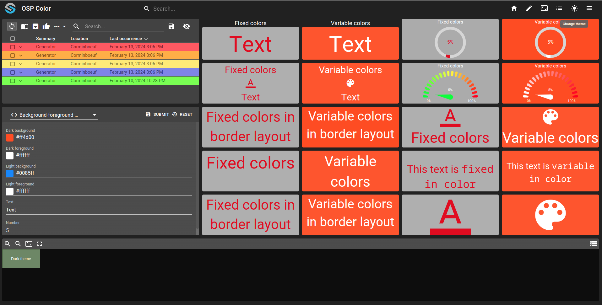
You can then press the Change theme interaction in the toolbar (right top, sun icon). The front-end will change to light theme and will show the following result:
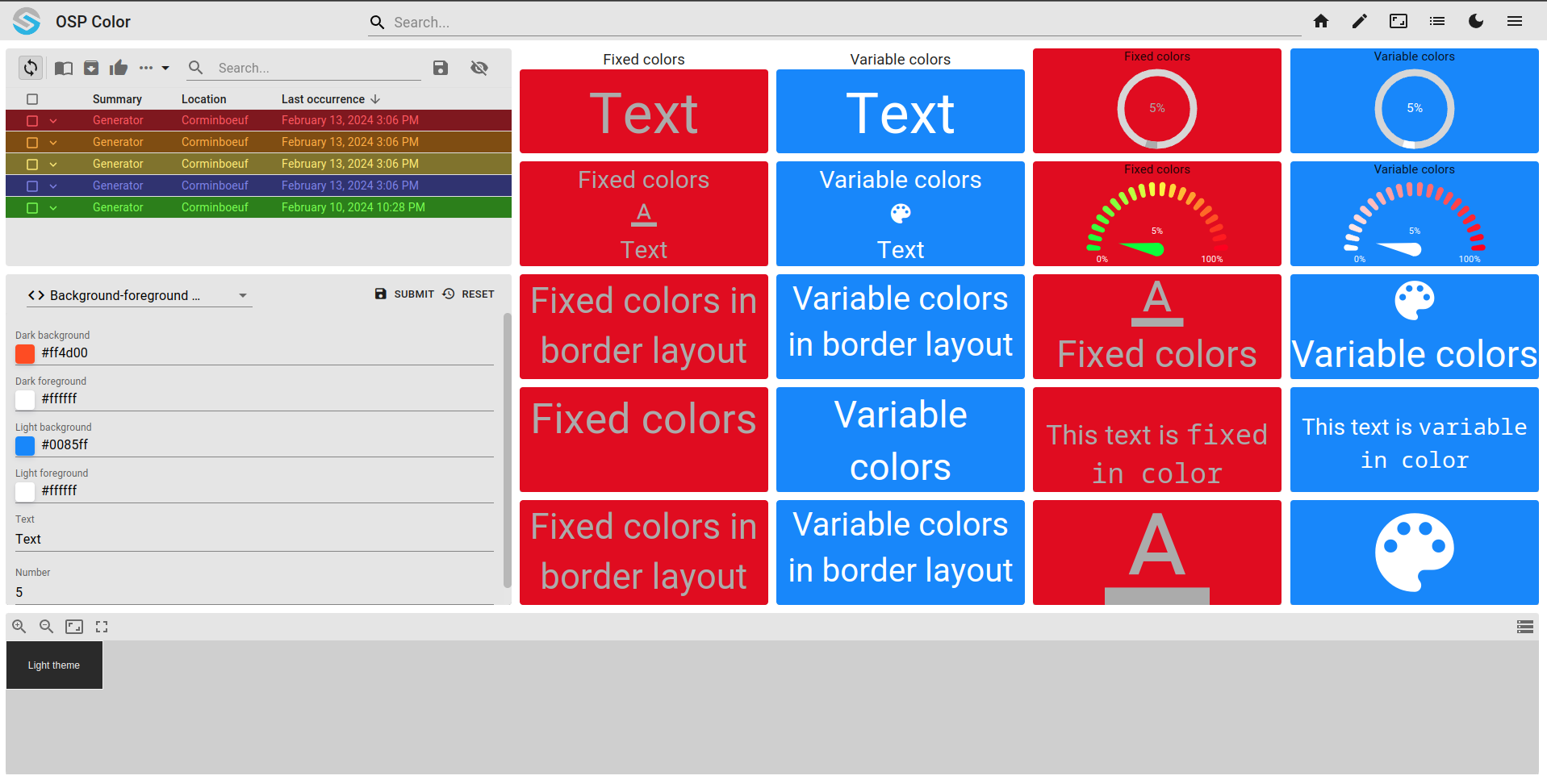
To achieve this result, we created a dashboard.view file with all widgets presents:
Alarm table widget with severities changing depending on theme color. You can find the information in
severity.web(for exampleroot.alarms.severities.major). All colors are declared with bothdarkandlightobject that support theme dependant color.{ "fgColor": { "dark": "#804d00", "light": "#ffaf33" }, "bgColor": { "dark": "#ffaf33", "light": "#804d00" }, "fgHiColor": { "dark": "#bf7400", "light": "#ffd799" }, "bgHiColor": { "dark": "#ffd799", "light": "#bf7400" }, "moduleId": "modules.web.web-1" }
In the first and 3rd column, widgets are bounds to theme. All foreground and background share the same approach (for example, widget
JV25qj2S):{ "fontColor": { "dark": "#e10e0e", "light": "#ababab" }, "backgroundColor": { "dark": "#ababab", "light": "#e10e0e" } }
In the second and last column, widgets are bound to theme as well as value. All foreground and background share the same approach (for example, widget
E7KLHFug):{ "fontColor": { "dark": { "reference": "root.feature.osp-colors.values.dark-foreground", "fallback": "#e10e0e" }, "light": { "reference": "root.feature.osp-colors.values.light-foreground", "fallback": "#ababab" } }, "backgroundColor": { "dark": { "reference": "root.feature.osp-colors.values.dark-background", "fallback": "#ababab" }, "light": { "reference": "root.feature.osp-colors.values.light-background", "fallback": "#e10e0e" } } }
Schematic in the last row is dependant on theme to display a different schematic based on theme:
{
  "schema": {
    "dark": "osp/resources/schematics/dark.drawio",
    "light": "osp/resources/schematics/light.drawio"
  }
}
Form widget allow user to update the value bound to widgets and value to see the result.