Basic Input Output Value
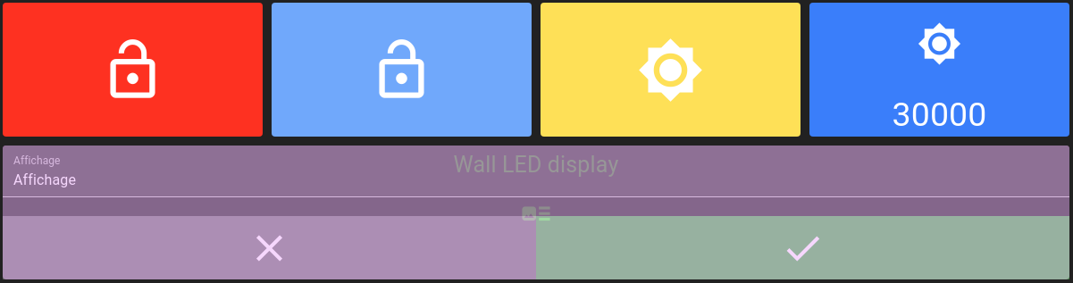
Basic I/O widget allows binding a value to a tile in a dashboard, both to display and to set its content.
Following types are available:
Boolean
Integer
Decimal
Text
It consists of three main parts:
Label: The widget label
Icon: An icon that best represents the value
Value: A description of the value
The layout decides which parts are displayed, in which order and in which direction.
Only one value subscription is allowed for the basic I/O widget.
List of configuration files
Filename |
Short description |
Format |
Link to documentation |
|---|---|---|---|
dashboard.view#BasicInputOutputValueWidget |
Defines the BasicInputOutputValueWidget widget global settings |
json |
List of examples
Short description |
Link to documentation |
|---|---|
Update a variable to trigger an alarm |
|
Lay out the parts of a widget and drive them at runtime |
Type of widget
Boolean widget


Integer/decimal widget
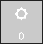


Text widget


Layout
The layout parameter lists the parts displayed by the widget, in the order they are displayed:
{
  "basicWidgetSettings": {
    "layout": ["icon", "label", "value"]
  }
}
A part left out of the list is not displayed, so ["label", "icon"] displays the label then the icon and hides the value.
When the parameter is absent, the label, the icon and the value are displayed in that order.
The layoutDirection parameter decides how the parts share the widget:
Value |
Description |
|---|---|
|
Parts are stacked from top to bottom. This is the default. |
|
Parts are displayed side by side from left to right, each one taking the same width. |
{
  "basicWidgetSettings": {
    "layout": ["icon", "value"],
    "layoutDirection": "row"
  }
}
Hint
Text is scaled to the space its part receives.
Displaying three parts in a row inside a wide but short widget leaves little width for each of them, which makes the label and the value small.
Icons
All icon parameters can be filled with value from Material-UI listing.
Values provided by Material-UI listing in CamelCase must be converted into snake_case for OnSphere:
LockOpen becomes lock_open
ViewList becomes view_list
Format specification
Extracted from the sprintf.js README
The placeholders in the format string are marked by % and are followed by one or more of these elements, in this order:
An optional number followed by a
$sign that selects which argument index to use for the value. If not specified, arguments will be placed in the same order as the placeholders in the input string.An optional
+sign that forces the result to be preceded with a plus or minus sign on numeric values. By default, only the-sign is used on negative numbers.An optional padding specifier that says what character to use for padding (if specified). Possible values are
0or any other character preceded by a'(single quote). The default is to pad with spaces.An optional
-sign, that causessprintfto left-align the result of this placeholder. The default is to right-align the result.An optional number, that says how many characters the result should have. If the value to be returned is shorter than this number, the result will be padded. When used with the
j(JSON) type specifier, the padding length specifies the tab size used for indentation.An optional precision modifier, consisting of a
.(dot) followed by a number, that says how many digits should be displayed for floating point numbers. When used with thegtype specifier, it specifies the number of significant digits. When used on a string, it causes the result to be truncated.- A type specifier that can be any of:
%— yields a literal%characterb— yields an integer as a binary numberc— yields an integer as the character with that ASCII valuedori— yields an integer as a signed decimal numbere— yields a float using scientific notationu— yields an integer as an unsigned decimal numberf— yields a float as is; see notes on precision aboveg— yields a float as is; see notes on precision aboveo— yields an integer as an octal numbers— yields a string as ist— yieldstrueorfalseT— yields the type of the argumentv— yields the primitive value of the specified argumentx— yields an integer as a hexadecimal number (lower-case)X— yields an integer as a hexadecimal number (upper-case)j— yields a JavaScript object or array as a JSON encoded string
onClick operation
The onClick operation of this widget can make use of dynamic evaluation.
In this operation, you have access to:
osp.widgets(id): to access any widget available in current dashboard using widgetid. This will allow access to widget exposed features.osp.navigate(path)to navigate to any dashboard see Navigation from widget contextosp.updateValue(id, content)to update a value with itscontent. The object formosp.updateValue({id, content})is also accepted.value: the current value displayed by the widget.osp.evaluate(code): to allow menucodeinteraction evaluation (see dynamic evaluation)
Widget context
Operations
Basic I/O widgets support following operations:
updateLabel(label: string)with the text to display as the label. An empty text falls back to the value name.updateIcon(icon: string)with the icon to display, taking precedence overonIcon,offIconandunknownIcon. An empty icon falls back to the configured icons.updateLayout(layout: string[])with the parts to display, in the order they are displayed, as in the layout parameter. Calling it without argument falls back to the configured layout.updateLayoutDirection(layoutDirection: string)with the direction the parts are displayed in,columnorrow, as in the layoutDirection parameter. Calling it without argument falls back to the configured direction.updateValueId(id: string)with theidof the value to display. Calling it without argument brings back the value declared by the widget.updateValue(id: string, content: any)to update a value with itscontent. The object formupdateValue({id, content})is also accepted.navigate(path: string)to navigate to any dashboard, see Navigation from widget context.evaluate(code)to evaluate an interactioncode(see dynamic evaluation).
The label, the icon, the layout, the direction and the value applied this way live as long as the widget is displayed. Reloading the page or navigating to another dashboard brings back what the configuration declares.
A value reached through updateValueId does not have to be declared by the widget.
Its type is read from the value itself, so the widget displays and interacts with it as it would with a declared one.
Its access rights are not: the widget keeps the rights of the value it declares, so a widget declared as READ stays read-only whichever value it displays.
A widget declaring no value at all treats them as READ.
A value the server reports as not updatable is displayed read-only as well, whichever rights the widget declares.