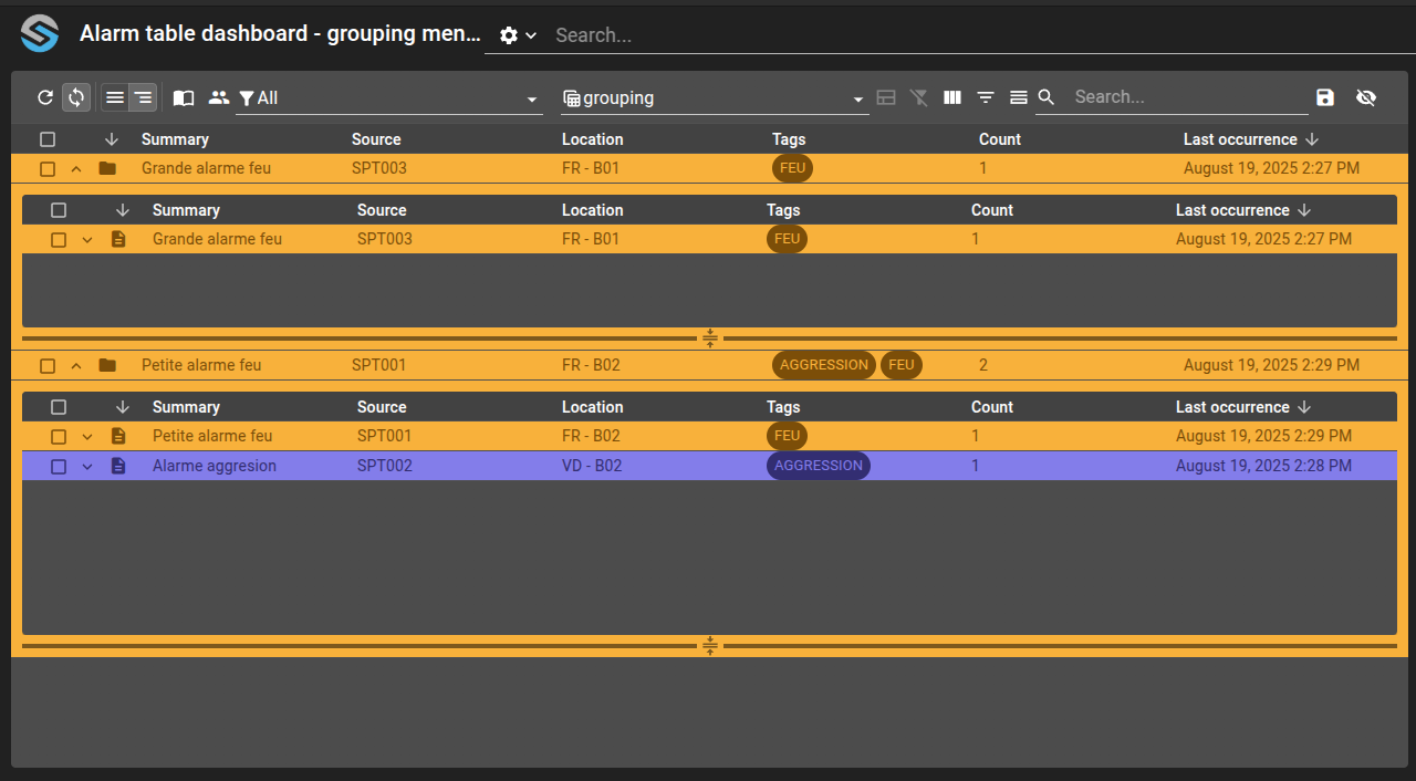
Define grouping menu to interact with groups from an alarm tableο
This example aims to display how you could use the grouping actions with an Alarm Table in order to interact with alarms groups.
Define four grouping menu entries:
CREATE_GROUP_ALARMS,REMOVE_GROUP_ALARMS,JOIN_GROUP_ALARMS, andLEAVE_GROUP_ALARMS.Use prompts in menu actions to let the user name or select groups interactively.
Create a custom view with a
BOOLEANcolumn linked to thechildrenfield to visually distinguish groups from simple alarms.Configure the alarm table with
defaultHierarchy: groupedto display alarm groups.
git checkout origin/osp-alarms-configuration .
git checkout origin/osp-web-configuration .
git checkout origin/example-dashboard-alarm-table-grouping-menus .
Stepsο
1. Define the grouping menuο
This step is separated in four steps, each one for one of the four actions described earlier.
CREATE_GROUP_ALARMSο
The CREATE_GROUP_ALARMS menu will only show when no alarms are selected and only from the widget toolbar, as we canβt create a menu directly with one or multiple alarms added to it, there is no need to have this menu accessible from the right-click of a row.
As an input to the action, we need four information:
visibleIfNoChildren: Indicates whether the group should be hidden when it has no member
fields: Override some or all the field generation define on module.alarms
actions: Override some or all the action handling define on module.alarms
name: Identifier of the group
In this example, we will retrieve a name for the group by providing the user with a prompt in which he can set the name. The others information are set directly by the menu.
The menu should look something like this:
root/alarms/menus/grouping/menu.web
{
"label": "Create group",
"icon": "group",
"context": [
{
"type": "AlarmTable",
"action": "root.alarms.actions.grouping.create_group",
"condition": "${alarms.selected}.length === 0",
"scopes": ["Toolbar"],
"input": {
"visibleIfNoChildren": {
"expression": "true",
"as": "boolean"
},
"fields": {
"expression": "[]"
},
"actions": {
"expression": "[]"
},
"name": {
"prompt": {
"type": "INPUT",
"insert": false,
"unique": false,
"labels": {
"title": "Group",
"message": "Please indicate the group name",
"save": "Save",
"cancel": "Cancel",
"placeholder": "Name"
}
}
}
}
}
]
},
REMOVE_GROUP_ALARMSο
The REMOVE_GROUP_ALARMS menu should be available only when the clicked alarm is an actual group. We verify this by checking the state of the alarm children field.
In addition, we also add a context to offer the possibility to remove by providing manually the name of the group. In order to help the user pick the name, we will offer him all the current groups name as options in a prompt.
In both case, we need to feed the action with the following input:
name: Identifier of the group
The menu should look something like this:
root/alarms/menus/grouping/menu.web
{
"label": "Remove group",
"icon": "group",
"context": [
{
"type": "AlarmTable",
"action": "root.alarms.actions.grouping.remove_group",
"condition": "${alarms.selected}.length === 0 && ${alarms.clicked}.children",
"scopes": ["Click"],
"input": {
"name": {
"extract": "alarms.clicked._id",
"as": "string"
}
}
},
{
"type": "AlarmTable",
"action": "root.alarms.actions.grouping.remove_group",
"condition": "true",
"scopes": ["Toolbar"],
"input": {
"name": {
"prompt": {
"type": "COMBO",
"insert": false,
"unique": false,
"items": "alarms.all[?(@.children !== null)].serial",
"labels": {
"title": "Group",
"message": "Please select a group",
"save": "Save",
"cancel": "Cancel",
"placeholder": "Serial"
}
}
}
}
}
]
}
JOIN_GROUP_ALARMSο
The JOIN_GROUP_ALARMS menu is available for every alarm. When using this menu, the user must choose the group he wants the selected/clicked alarms to be added to.
We need to feed the action with the following input:
alarmsIds: Ids of the selected/clicked alarms
group: Identifier of the group to add the alarms to
The menu should look something like this:
root/alarms/menus/grouping/menu.web
{
"label": "Join group",
"icon": "group",
"context": [
{
"type": "AlarmTable",
"action": "root.alarms.actions.grouping.join_group",
"condition": "${alarms.selected}.length > 0",
"input": {
"alarmsIds": {
"extract": "alarms.selected[*]._id"
},
"group": {
"prompt": {
"type": "COMBO",
"insert": false,
"unique": false,
"items": "alarms.all[?(@.children !== null)].serial",
"labels": {
"title": "Group",
"message": "Please select a group",
"save": "Save",
"cancel": "Cancel",
"placeholder": "Serial"
}
}
}
}
},
{
"type": "AlarmTable",
"action": "root.alarms.actions.grouping.join_group",
"condition": "${alarms.selected}.length === 0",
"scopes": ["Click"],
"input": {
"alarmsIds": {
"extract": "alarms.clicked._id"
},
"group": {
"prompt": {
"type": "COMBO",
"insert": false,
"unique": false,
"items": "alarms.all[?(@.children !== null)].serial",
"labels": {
"title": "Group",
"message": "Please select a group",
"save": "Save",
"cancel": "Cancel",
"placeholder": "Serial"
}
}
}
}
}
]
},
LEAVE_GROUP_ALARMSο
The LEAVE_GROUP_ALARMS menu works similarly to the JOIN_GROUP_ALARMS menu. The only difference is that we need to check that the alarms are currently in a group. To verify that, we can verify that groupAlarmId is set.
We need to feed the action with the following input:
alarmsIds: Ids of the selected/clicked alarms
group: Identifier of the group to add the alarms to
The menu should look something like this:
root/alarms/menus/grouping/menu.web
{
"label": "Leave group",
"icon": "group",
"context": [
{
"type": "AlarmTable",
"action": "root.alarms.actions.grouping.leave_group",
"condition": "!!${groupAlarmId} && ${alarms.selected}.length > 0",
"input": {
"alarmsIds": {
"extract": "alarms.selected[*]._id"
},
"group": {
"extract": "groupAlarmId",
"as": "string"
}
}
},
{
"type": "AlarmTable",
"action": "root.alarms.actions.grouping.leave_group",
"condition": "!!${groupAlarmId} && ${alarms.selected}.length === 0",
"input": {
"alarmsIds": {
"extract": "alarms.clicked._id"
},
"group": {
"extract": "groupAlarmId",
"as": "string"
}
}
}
]
},
2. Define the dashboardο
Before creating the dashboard, we will define a new view.web with a specific column that will help the user to visually tell which row is a group and which one is a simple alarm.
Viewο
We will use a column with a BOOLEAN render and use the ability to define icons for each state of the boolean value (true/false/undefined). To do so, we link that column to the children field.
If this field is true, we display the folder icon and if it is false, the one for the simple alarm.
root/alarms/views/grouping/view.ospp
{
"name": "Type",
"field": "children"
},
root/alarms/views/grouping/view.web
{
"name": "Type",
"render": "BOOLEAN",
"position": 0,
"width": "40 px",
"filterable": false,
"sortable": true,
"options": {
"undefinedIcon": "clear",
"falseIcon": "description",
"trueIcon": "folder",
"strictBoolean": false
}
},
Dashboardο
Finally, we simply create a dashboard with an Alarm Table widget. The table will be configured with these notable settings:
defaultView: with the previously defined view
defaultHierarchy: with grouped to display the alarms groups
Your Dashboard view file should look like:
root/dashboard/grouping/dashboard.view
{
"configuration": [
{
"type": "AlarmTable",
"id": "amq94Tog",
"title": "",
"menuReferences": [
"root.alarms.menus.grouping"
],
"alarmWidgetSettings": {
"defaultFilter": "root.alarms.filters.all",
"defaultView": "root.alarms.views.grouping",
"defaultHierarchy": "grouped",
"disabledHierarchies": [],
"shareFiltersBetweenTables": true,
"displayAlarmGroupsWhenShowingEveryAlarm": false,
"resizeMode": "widget",
"rowDetailHeight": 250,
"disableResizeRowDetailHeight": false,
"rowDetailMinHeight": 150,
"rowDetailMaxHeight": 500,
"disableFilterUpdate": false,
"disableViewUpdate": false,
"disableUrlHistory": true,
"disableToolbar": false,
"disableToolbarMenu": false,
"enableAutomaticRefresh": true,
"disableToolbarTableRefresh": false,
"disableToolbarTableAutoRefresh": false,
"disableToolbarJournal": false,
"disableToolbarExport": false,
"disableToolbarColumnShowHide": false,
"disableToolbarFilterShowHide": false,
"disableToolbarSummaryShowHide": false,
"disableToolbarSearch": false,
"disableToolbarColumnChooser": false,
"disableToolbarClearFilter": false,
"showColumn": true,
"showFilter": false,
"showSummary": false,
"disableUserUpdatedColumnsMemoization": false,
"disableToolbarClearUserUpdatedColumns": false
}
}
],
"layout": {
"lg": [
{
"w": 12,
"h": 4,
"x": 0,
"y": 0,
"i": "amq94Tog"
}
]
},
"breakpoints": {
"lg": 1200,
"md": 996,
"sm": 768,
"xs": 480,
"xxs": 0
},
"cols": {
"lg": 12,
"md": 10,
"sm": 6,
"xs": 4,
"xxs": 2
},
"rowHeight": 150
}
And visually on your browser the dashboard should look like: