Collection Table
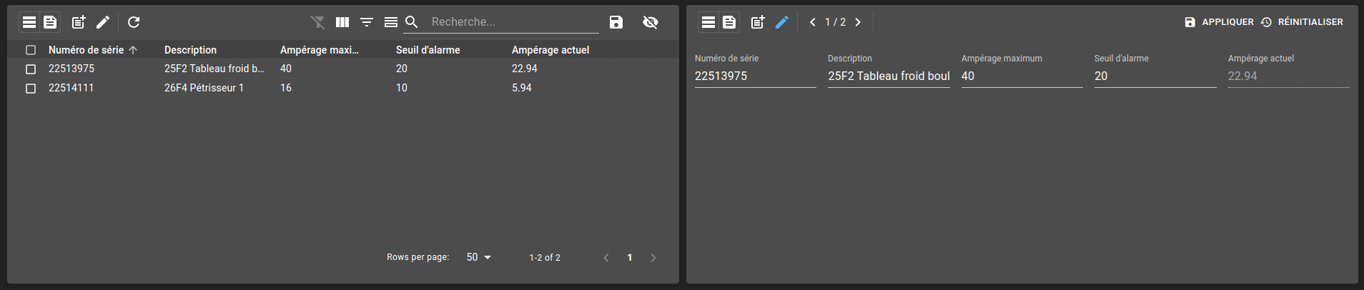
Collection table widgets allow showing collection elements with specified filters and view in the dashboard. It displays columns based on view.
There are two different aspects to a Collection table :
Listing of collections elements
Editing a collection element
List of configuration files
Filename |
Short description |
Format |
Link to documentation |
|---|---|---|---|
dashboard.view#CollectionTable |
Defines the CollectionTable widget global settings |
json |
List of examples
Short description |
Link to documentation |
|---|---|
Display the elements of a collection |
|
Delete an element of a collection through a menu |
|
Setup your configuration to gain access to collections rights |
Setup your configuration to gain access to collections rights |
Show a Collection table with data from multiple collections |
|
Use collection to perform silencing mode (hide until) on alarms |
Table
Toolbar
As for the AlarmTable, a CollectionTable can display a toolbar containing different actions :
Switching views
At the left end of the toolbar, two icons allow you to switch between table and form views. Next to them, a button allows entering the form view to create a new element and the button next to it allows you to update.
When in update mode, the form depends on the selected elements. If you select multiple elements and go into update mode, you can navigate between each element and update each one of them. The update is only on the current shown element. You can’t update all the selected elements at once.
Refresh
You can force a table refresh by clicking the refresh icon.
Schemas, Filters and Views
You can change a collection based on the schema defined in your configuration. Only schemas with view(s) configured can be displayed in a collection table.
You can apply one of the filters defined in your schema. Theses filters can be filtered by using the includeFilters and excludeFilters properties. includeFilters specifies filters which should be offered for this widget and excludeFilters the ones which should not.
Note
If you set both, first all filters not present in the include list will be removed. Then, from that list, the filters presents in the exclude list are removed.
Following the same principles, you can filter the table with a view, from views defined in your schema. You have the possibility to filter views offered the same you can can filters.
Change table structure
Three options can change the structure of a table:
Show/hide column: displays the names of the columns at the top of the table, as well as an option to select/unselect all rows.
Show/hide filter: displays filters options for each column, depending on the value type.
Show/hide summary: displays a summary at the bottom of the table (ie: rows, count, sum of a column,…).
Clear filters
Remove all current filters and reset the default ones.
Search
You can search the table by searching for a text (column with text value) or for a tag.
Export
The export button can export multiples rows into an excel file. Either export every row or export only selected ones.
Show/Hide column
You can show or hide a particular column with the Show Column Chooser. These will also change depending on current view.
Form
A form can be bound to a collection to insert/update an element of a collection. To use a form with collections, the form must submit with Request as its destination.
The second aspect of a CollectionTable is the form. view, allowing to create/modify an element of the collection.
You can navigate between all the elements present in the table or the selected ones.
Create
You can enter create mode by using the button on the left of the toolbar. When entering create mode, you are locked into this specific element until you leave this mode. When you save your modifications, the element is created and you should see the list updated automatically (you might not see it depending on the filters you have).
Once the element is created, every modification will update it. To create another one, you need to leave create mode (use the same button or the close icon next to it) and get back into it.
Update
You can enter update mode by using the pencil icon next to the create button. When in update mode, you can navigate between every elements of a table (or the selected ones) and update them on the fly.
Historic
You can enter historic mode by using the timer icon next to the pencil button. When in history mode, a new selector appears at the right of the icon. This selector let you choose between the different versions of the current element. While in historic mode, you can’t edit the element.

Table with multiple collections
By default, a table displays the content of only one collection, but you can change this behavior. When setting multiple, the table will allow you to select more than one collection and merged their content together.
You will be able to edit any element of the table, with a form that is chosen based on the collection the element is from. Creating a new element will also let you choose the form you want, allowing you to choose in which collection the new element is inserted.
When more than one collection is selected, the only available views and filters are limited to the ones that share a common id.
Views
Only views that are shared between the selected collections (determined by the id of the view) are available. However, only one of the views is actually applied. If we select three collections that all have a view default, we don’t get access to three views, but only one of them, which is chosen based on the order of the selected collections. The view of the first collection, ordered by the collection name, is the one that will be applied when selecting default as a view. The others cannot be applied to the table. Therefore, we suggest that you create the exact same view for all the collections that you intend to display together.
When defining the view, be aware of the collections structural differences. For example, if we want to display a phone book containing info from a person collection as well as from a company one, these two collections might not have the exact same properties. A company might referenced a website address, where a person wouldn’t. You can either define a view that only contains the properties in common from both collections, or a view with a how many columns you want, without checking the fact that they exist in both collections or not.
If you define your view with a column website, this view will be accepted for the company collection, but might be rejected for the person collection, as the website property doesn’t exist in the that collection. By default, all the columns of a view must match an actual property of the collection. In order to disable this behavior and allow the creation of our view, set the view allowNullColumns setting as true. The column website will be filled with the company value and will be left blank on a person’s row. This example is further explained in the example section.
Filters
Only filters that are shared between the selected collections (determined by the id of the filter) are available. Each collection define their own filter behavior. When selecting a filter, each collection is filtered based off their own filter and are never impacted by the filters defined in the other collections.
User subscriptions list
Warning
 This feature is currently in beta. It may change in a future version without prior notice. See the Beta Features page for the full list of beta features and their planned release. If you’re using this feature, we encourage you to share your feedback to help with the evaluation process.
When viewing or editing a collection entry, a list of users currently subscribed to the same entry is displayed on the right side of the toolbar. It shows each user’s username and the last time they updated the entry. This gives insight into who may be concurrently editing the same record.
URL parameters
This widget handle URL parameters. These are the available parameters:
filter: change the active filter (ItemId)view: change the active view (ItemId)schemas: change the active collections (ItemId)search: set the search term (string)currentPage: current pagedisplay: change the current display mode (tableorform)entryId: set the current entry with an id from the MongoDB document. This changes the display intoformmode and load the associated entry.
Set disableUrlHistory to true in the widget settings to stop this widget reading and writing these parameters. See Disabling the parameters.
Widget context
Operations
Collection tables support following operation:
appendFilter(columnName: string, value?: string, operation?: string)with column name, value (empty clears filter) and operation (see below) in parameters appended to the current filteringappendFilters(columnName: string, value?: string, operation?: string)with column name, value (empty clears filter) and operation (see below) in parameters appended to the current filteringupdateFilter(id: string)with a filteridto change the current selected filter of the table.updateView(id: string)with a viewidto change the current selected view of the table.updateSchema(id: string | string[])with one or multiple (string or string array) schemaidto change the current selected schemas of the table.
Built-in filter operations are:
contains (default)
notContains
startsWith
endsWith
equal
notEqual
greaterThan
greaterThanOrEqual
lessThan
lessThanOrEqual
between
dayEqual
Context
The widget context can be accessed from menus to fetch these different values from the table:
rowsall: all rows (list)clicked: clicked row (object)selected: selected rows (list)column: column with name and title (object)value: value of the cell
schema: Item id of the currently selected schemaview: current view id of the tablefilter: current filter id of the tabledisplay: current display view of the table (‘table’ or ‘form’)formModality: Only if display is form, current modality of the form (‘create’, ‘update’, ‘view’, ‘history’)document: Only if display is form, current selected entry displayed as a formcolumnFilter: current filters on the table (list)columnOrder: list of all columns names in orderhiddenColumnNames: list of hidden columns