Form
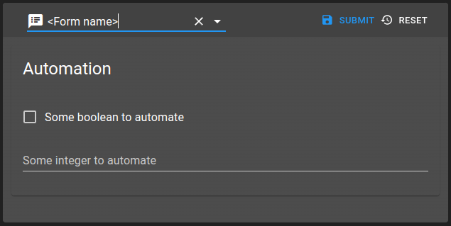
Form is a web widget used to allow users to interact with data of the system. It can be used directly as a widget or included transparently into other widgets like Collection Table. Behind the scenes, this widget uses the library JSON Forms.
A form must be declared as form.web in root hierarchy. Its content defines :
data schema reference
UI shape
initial data
rights applied to parts of the form
value bindings
form submission mechanism
Capabilities
Generic form capabilities
Capability |
Support |
Comment |
|---|---|---|
Using form as a dashboard widget |
|
See Form |
Using form to update a collection |
|
A form can be bound to a collection to |
Using form to update values |
|
|
Using form to update values and collection in same time |
|
This can be done with standard scripting, beware to the order of action and reaction to avoid conflicts |
Creating custom form |
|
See Form definition |
Create conditional forms |
|
|
Using (read) value in forms |
|
A form can be bind to a value Using form linked to a value (read). |
Trigger action in forms submission |
|
Trigger an action on submission All data content will be posted to an action running a script. |
Trigger both action and |
|
Update destination Acts as |
Trigger |
|
See Trigger an action on submission for details. |
Modify elements based on the current user’s permissions. |
|
See Rights for details. |
Immediate transmission of modification |
|
See Submission mode for details. |
Manage conflicts |
|
|
Retrieve data from an external api |
|
See API service and Api service picker for details. |

List of configuration files
Filename |
Short description |
Format |
Link to documentation |
|---|---|---|---|
dashboard.view#FormWidget |
Defines the Form widget global settings |
json |
List of examples
Short description |
Link to documentation |
|---|---|
Dynamic colors with form setting values |
|
Use a form as a prompt for a menu |
UI components
UI forms are generated through ui definitions. Two element types are available:
Control elements: They manage values bound to schema definition
Layout elements: They allow organizing elements
Control elements
Control are described in following documentation.
Control elements require a scope element referring the data bindings. More settings such as label and various options can be setup for each control element.
Based on JSON schema type, different render will be used. They are described in depth in following documentation.
Depending on data, it is possible to show, hide, disable or enable the control element. They are described in following documentation.
The following example shows how 4 input list linked together can be used. It uses the hierarchy: .
More control elements are supported in OnSphere. They are described in the following sub sections.
Options validation
Like stated before, most control elements allow customizing them by providing various options. If provided, these options are validated before the control element is created. If one of the options doesn’t match what is expected, the form will present an error text input with buttons (example below) allowing you to see/copy the error so that you can attempt to fix the provided options.

Override basic types
Note
By default, form will automatically detects what UI component to show. Some edge cases might need to override its detection by providing which component to show.
Overriding basic types might be needed when you face ['string', 'boolean', 'number'] type definition, for example. The library will not be able to properly bind it to the desired UI.
For this, you can provide, in options:
Setting |
Usage |
Type |
Default value |
|---|---|---|---|
render |
Override type definition |
|
|
toggle |
Only used when |
|
|
Usage:
{
  "type": "Control",
  "scope": "#/properties/multipleTypeValue",
  "label": "Value",
  "options": {
    "render": "string"
  }
}
Date, time and date-time pickers
Date and time pickers are rendered automatically when a Control is bound to a property using one of the date, time or date-time formats. The format can be declared either on the JSON schema property ("format": "date-time") or directly in the control options ("format": "date-time").
The bound property must be of type number: the picked value is stored as a timestamp expressed in nanoseconds.
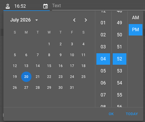
The three pickers share the following options:
Setting |
Usage |
Type |
Default value |
|---|---|---|---|
focus |
Automatically focus the input when the form is displayed. |
|
|
trim |
When |
|
|
autoFill |
When |
|
|
Date-time picker (date-time format) additional options:
Setting |
Usage |
Type |
Default value |
|---|---|---|---|
dateTimeFormat |
Format used to display the value in the input. |
|
|
dateTimeSaveFormat |
Format used to validate the value before saving. |
|
|
ampm |
Display the time using a 12-hours (AM/PM) clock. |
|
|
views |
Ordered list of the picker views to display. |
Subset of |
|
Date picker (date format) additional options:
Setting |
Usage |
Type |
Default value |
|---|---|---|---|
dateFormat |
Format used to display the value in the input. |
|
|
dateSaveFormat |
Format used to validate the value before saving. |
|
|
views |
Ordered list of the picker views to display. |
Subset of |
|
Time picker (time format) additional options:
Setting |
Usage |
Type |
Default value |
|---|---|---|---|
timeFormat |
Format used to display the value in the input. |
|
|
timeSaveFormat |
Format used to validate the value before saving. |
|
|
ampm |
Display the time using a 12-hours (AM/PM) clock. |
|
|
views |
Ordered list of the picker views to display. |
Subset of |
|
Usage:
{
  "type": "Control",
  "scope": "#/properties/hideUntil",
  "label": "Hide until",
  "options": {
    "format": "date-time",
    "autoFill": true
  }
}
Action
Action allow to evaluate and run an action.ospp. In the options property, you can define an action context by setting :
action: item id of the action to runinput: define the data passed to the action. Context provided by the form contains aformobject that contains the data of the form.output: define actions or operations to call when the action is finished
Note
For more details about input and output, check menus and toolbar documentation.
An action component may have a scope associated. If it is the case, scope must target an integer value. This value is incremented after each successful run of the action. This value can be useful to show/hide some part of the form depending on if the user ran the action or not.
Usage:
{
    "type": "Action",
    "label": "Acknowledge",
    "options": {
        "action": "root.alarms.actions.acknowledge",
        "input": {
            "alarmsIds": {
                "extract": "form.alarmsIds[*]"
            }
        }
    }
}
Example
Attachment
Attachment component allow to upload and visualize one file. Once the file is uploaded, an string identifier is returned and used as data for the component. This implies that the field associated to this component must be of type string.
The component can have multiple states (displayed below from left to right):
empty: show an button to upload / drag and drop a file
file: show a preview of the attachment
error: show a red box if the attachment could not be loaded
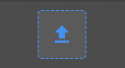

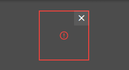
Furthermore, depending the type of the attachment, the preview may differs. If the attachment is an image, a video or a PDF, a preview of the file is shown. For any other type of files, a simple icon with the filename is displayed.
Upon clicking on the component, depending on the state multiple effect can occur:
empty: show a modal to upload a file
file: show the attachment in a modal
error: nothing
To remove the attachment, use the icon on the top right corner of the component.
The options settings are:
Setting |
Usage |
Type |
Default value |
Examples |
|---|---|---|---|---|
uploadId |
Id of the upload configuration entity used to upload the file. |
string |
|
|
contentPlacement |
Placement of the component within the available space in the form, either at start, center or end of it. |
|
|
|
width |
Width of the component that contains the attachment. |
|
|
|
height |
Height of the component that contains the attachment. |
|
|
|
Attachments list / grid
Display a list of Attachment components for every entry of a list of string identifiers, either on the form of a horizontal List or a Grid.
The choice between List or Grid is defined by the type option and is purely a visual difference. Both have access to the same features.
List
Display the elements as a horizontal list with a horizontal scroll bar.

The options settings are:
Setting |
Usage |
Type |
Default value |
Examples |
|---|---|---|---|---|
type |
Type of display. For List display, type must be set as List. |
|
|
|
uploadId |
Id of the upload configuration entity used to upload the file. |
string |
|
|
previewBehavior |
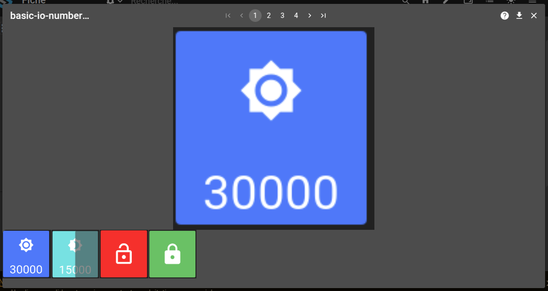
Defines how the preview modal behave when clicking on one attachment. SHOW_ALL makes so a list with previews of the other attachments are displayed below the selected one. SHOW_ONLY_SELECTED makes so only the selected attachment is shown on the modal. |
|
|
|
previewShowNavigation |
Enable / Disable the pagination component on the top of the preview. |
|
|
|
rowHeightInPx |
Height of the component in pixels. Each attachment size are also linked to this value (both height and width) |
|
|
|
Grid
Display the elements on a grid with a customizable number of cols.
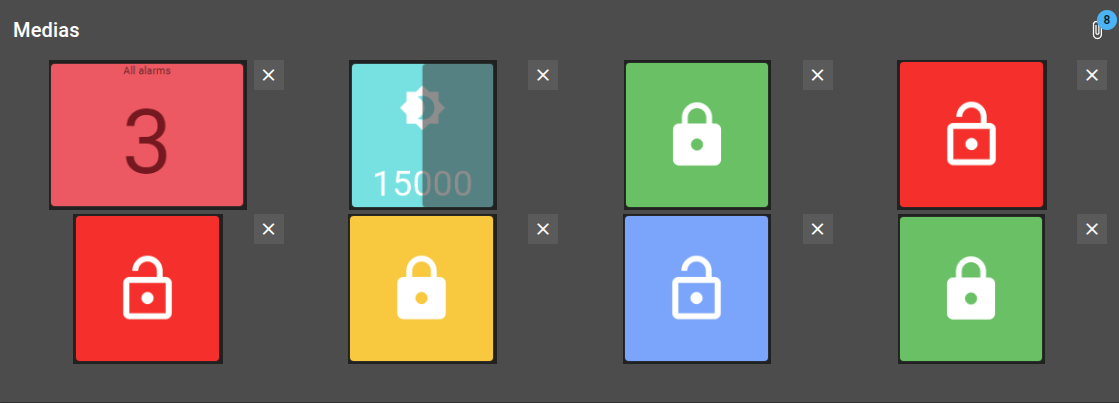
The options settings are:
Setting |
Usage |
Type |
Default value |
Examples |
|---|---|---|---|---|
type |
Type of display. For Grid display, type must be set as Grid. |
|
|
|
uploadId |
Id of the upload configuration entity used to upload the file. |
string |
|
|
previewBehavior |
Defines how the preview modal behave when clicking on one attachment. SHOW_ALL makes so a list with previews of the other attachments are displayed below the selected one. SHOW_ONLY_SELECTED makes so only the selected attachment is shown on the modal. |
|
|
|
previewShowNavigation |
Enable / Disable the pagination component on the top of the preview. |
|
|
|
rowHeightInPx |
Height of one row of the grid. Each attachment size are also linked to this value (height) |
|
|
|
cols |
Number of columns the grid contains. Each attachment size are also linked to this value (width takes 100% of the cell size) |
|
|
|
Features
Both support drag-and-drop to upload elements or you can open an upload prompt using the button on the right top corner.
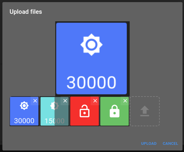
When clicking on one of the attachments, a preview modal is open with the selected element. Depending on the options, the preview allows to navigate directly between all the attachments.
Collection: Checkbox group
Checkbox group allows you to bind collections values to a checkbox group as shown below.
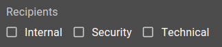
The options settings are:
Setting |
Usage |
Type |
Default value |
Examples |
|---|---|---|---|---|
as |
Setting ‘as’ with ‘object’ makes that selecting an entry keeps the entry as a full object, containing every field of the collection entry. Otherwise, the ‘format’ parameter is used to transform the collection entry into a string value. |
|
|
|
creationForm |
Form to use to create a new entry into the linked collection (schema option). If a new entry is successfully created, it will be automatically selected. This option is accessible using a ‘+’ icon that appears next to the label, if a creationForm was fed. |
form.web path |
|
|
filterId |
Id of one of the filters of the linked collection (schema option). Used to filter the option of the component. |
string |
|
|
filters |
List of custom Filters used to filter the option of the component. The structure of this filters is explained here. The |
List of Filters |
|
|
format* |
Collection formatter used to transform the collection entries. Used for displaying the options as well as to format the collection entry before saving. The later is only true if the option |
Variable replacement string |
|
|
schema* |
Reference to the collection the component will query his options from. |
schema.ospp path |
|
|
sorts |
List of sorting applied to options |
Sorting operation as {“field”: “<field-name>”, “operation”: “<ASC or DESC>”} |
|
|
projection |
Projection to apply to the request to include/removed one or multiple fields from the result |
Projection as {“fields”: [“<field-name>”, …], “included”: “<true or false>”} |
|
Add new entry into the collection
If you set a creationForm, a button will be present next to the label. This button will display the given form inside a popup window. Complete the form and save it to add a new entry. The newly added entry will be automatically selected.
Usage
{
  "type": "CheckboxGroup",
  "scope": "#/properties/recipients",
  "label": "Recipients",
  "options": {
    "schema": "root.collections.recipients",
    "format": "${name}",
    "sorts": [{ "field": "name", "operation": "ASC" }]
  }
}
The recipient schema is:
{
  "schema": {
    "type": "object",
    "properties": {
      "name": {
        "type": "string"
      }
    },
    "required": [
      "name"
    ]
  }
}
Collection: Combo box
Collection combo box allows user to pick a dynamic value from a collection.

The options settings are:
Setting |
Usage |
Type |
Default value |
Examples |
|---|---|---|---|---|
as |
Setting ‘as’ with ‘object’ makes that selecting an entry keeps the entry as a full object, containing every field of the collection entry. Otherwise, the ‘format’ parameter is used to transform the collection entry into a string value. |
|
|
|
creationForm |
Form to use to create a new entry into the linked collection (schema option). If a new entry is successfully created, it will be automatically selected. This option is accessible using a ‘+’ icon that appears next to the label, if a creationForm was fed. |
form.web path |
|
|
dependsOn |
Defines a list of dependencies on others properties from the schema. This element is only editable if all the properties listed as dependence as a valid value. |
List of string (schema properties) |
|
|
filterId |
Id of one of the filters of the linked collection (schema option). Used to filter the option of the component. |
string |
|
|
filters |
List of custom Filters used to filter the option of the component. The structure of this filters is explained here. The |
List of Filters |
|
|
format* |
Collection formatter used to transform the collection entries. Used to format the value of the input. Can also be used to format the options if no |
Variable replacement string |
|
|
freeInput |
If set to true, you will be able to input a value that is not bound to provided options. Unlike the add feature provided by the |
boolean |
|
|
getId |
If set to true, upon selecting an entry of the collection, the unique identifier |
boolean |
|
|
multi |
If set to true, handle an array of values instead of a unique value. |
boolean |
|
|
optionsFormat* |
Collection formatter used to transform the collection entries. Used to format the options of the selector. Can also be used to format the input value if no |
Variable replacement string |
|
|
schema* |
Reference to the collection the component will query his options from. |
schema.ospp path |
|
|
caseSensitive |
Determine whether to perform case-sensitive or case-insensitive search with |
boolean |
|
|
searchMethod |
Define how search is handled. |
|
|
|
searchTerms |
Define the list of fields upon which the |
Array of string |
|
|
sorts |
List of sorting applied to options |
Sorting operation as |
|
|
projection |
Projection to apply to the request to include/removed one or multiple fields from the result |
Projection as {“fields”: [“<field-name>”, …], “included”: “<true or false>”} |
|
Add/Edit entry into the collection
If you set a creationForm, a button will be present on the right end of the input. This button will display the given form inside a popup window.
If no value is currently selected, the button allows to create an entry. Complete the form and save it to add a new entry. The newly added entry will be automatically selected.
If a value is selected, the form will allow you to modify it. After saving, the value of the input is automatically updated.
Depends on
Collection input list using dependsOn must follow below structure to work. It allows user to create combo box hierarchy.
{
    "name": "Some value",
    "nodes": [{
        "name": "Some children",
        "nodes": [{
            "name": "Some sub-children",
            "nodes": []
        }]
    }, {
        "name": "Another children",
        "nodes": [{
            "name": "Another sub-children",
            "nodes": []
        }]
    }]
}
The following example shows how 4 input list linked together can be used. It uses the hierarchy: site > building > floor > premise.
{
  "type": "HorizontalLayout",
  "elements": [
    {
      "type": "Collection",
      "scope": "#/properties/site",
      "label": "Site",
      "options": {
        "schema": "root.collections.site",
        "format": "${name}",
        "dependsOn": [],
        "sorts": [{ "field": "name", "operation": "ASC" }]
      }
    },
    {
      "type": "Collection",
      "scope": "#/properties/building",
      "label": "Building",
      "options": {
        "schema": "root.collections.site",
        "format": "${name}",
        "dependsOn": ["site"],
        "sorts": [{ "field": "name", "operation": "ASC" }]
      }
    },
    {
      "type": "Collection",
      "scope": "#/properties/floor",
      "label": "Floor",
      "options": {
        "schema": "root.collections.site",
        "format": "${name}",
        "dependsOn": ["site", "building"],
        "sorts": [{ "field": "name", "operation": "ASC" }]
      }
    },
    {
      "type": "Collection",
      "scope": "#/properties/premise",
      "label": "Premise",
      "options": {
        "schema": "root.collections.site",
        "format": "${name}",
        "dependsOn": ["site", "building", "floor"],
        "freeInput": true,
        "sorts": [{ "field": "name", "operation": "ASC" }]
      }
    }
  ]
}
Usage
{
  "type": "Collection",
  "scope": "#/properties/priority",
  "label": "Priorité",
  "options": {
    "schema": "root.chv.collections.priorities",
    "format": "${name}",
    "sorts": [{ "field": "name", "operation": "ASC" }]
  }
}
The priority schema is:
{
  "schema": {
    "type": "object",
    "properties": {
      "name": {
        "type": "string"
      },
      "colorBg": {
        "type": "string"
      },
      "colorFg": {
        "type": "string"
      }
    },
    "required": [
      "name"
    ]
  }
}
Collections: collections rights
Collections rights allows user to define a list of collections rights. This component is meant to be use with rights collections. For any given collection, you can:
set if the user can create an new entry
set if the user can read the entries of the collection
set if the user can update any entry
set if the user can delete any entry
set a list of properties that can be modified by a user when updating any entry
set a list of the entries the user has access
set a list of filters that the entries must match in order to be accessible for the user

Usage:
{
  "type": "CollectionsRights",
  "scope": "#/properties/collections",
  "label": "Collections rights"
}
The property collections must have the required properties. You can look at the property collections of the user rights schema validator to get the list of required properties.
Collections: collection rights selector
This selector is a simpler version of collections rights component. This allows you to set the list of the entries the user has access without having to deal with the rest of the rights.

The options settings are:
Setting |
Usage |
Type |
Default value |
|---|---|---|---|
schema* |
ItemId of the targeted collection schema |
ItemId |
|
canCreate |
set if the user can create an new entry |
boolean |
false |
canRead |
set if the user can read the entries of the collection |
boolean |
true |
canUpdate |
set if the user can update any entry |
boolean |
false |
canDelete |
set if the user can delete any entry |
boolean |
false |
Usage:
{
  "type": "ServiceCollectionRights",
  "scope": "#/properties/collections",
  "label": "Sites",
  "options": {
    "schema": "root.chv.collections.site"
  }
}
The property collections must have the required properties. You can look at the property collections of the user rights schema validator to get the list of required properties.
Collections: forms rights selector
Forms rights selector allows user to define a list of form rights. This component is meant to be use with rights collections.

The options settings are:
Setting |
Usage |
Type |
Default value |
|---|---|---|---|
limitTags |
Maximum tags shown in the component when closed. Doesn’t limit the number of selected elements. |
number |
6 |
Usage:
{
  "type": "FormsRightsSelect",
  "scope": "#/properties/forms",
  "label": "Forms rights",
  "options": {
      "limitTags": 6
  }
}
Color picker
Color picker allows user to input color.
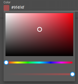
The options settings are:
Setting |
Usage |
Type |
Default value |
|---|---|---|---|
format |
Color picker format |
hex, hsl, hsv, rgb, hex8 |
hex |
Usage:
{
  "type": "Color",
  "scope": "#/properties/color",
  "label": "Color",
  "options": {
    "format": "hsl"
  }
}
Slider
Slider allows the user to input a numeric value by dragging a handle. It must be bound to a number property, using a Control with the type option set to slider.
The options settings are:
Setting |
Usage |
Type |
Default value |
|---|---|---|---|
valueLabelDisplay |
Controls when the value label is displayed above the handle. |
|
|
Usage:
{
  "type": "Control",
  "scope": "#/properties/level",
  "label": "Level",
  "options": {
    "type": "slider",
    "valueLabelDisplay": "auto"
  }
}
Switch
Switch renders a boolean value as a toggle switch. It must be bound to a boolean property, using a Control with the type option set to switch.
Note
A boolean can also be rendered as a switch through the Override basic types mechanism, by setting render to boolean and toggle to true.
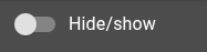
This component doesn’t have any options.
Usage:
{
  "type": "Control",
  "scope": "#/properties/enabled",
  "label": "Enabled",
  "options": {
    "type": "switch"
  }
}
Severity picker
Severity picker allow user to input severity.
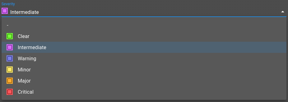
The options settings are:
Setting |
Usage |
Type |
Default value |
|---|---|---|---|
includeSeverities |
Severities IDs (e.g. |
|
|
excludeSeverities |
Severities IDs (e.g. |
|
|
Journal widget
Journal widget allow user to input entries with their user, timestamp and message.
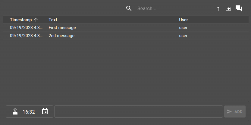
The options settings are:
Setting |
Usage |
Type |
Default value |
|---|---|---|---|
journalWidgetSettings |
Journal widget settings |
||
height |
Journal widget height |
CSS height |
300px |
Journal input and table override
You can override the default input in order to create more complex journal entries. You can use another form to define the input layout and components, allowing you to customize the journal content.
In addition to customizing the input form, you can also define the columns of the table part, allowing you to show in the table the customized fields of your journal.
To see how to implement these, please take a look at the Customize the input and table of a form journal component example.
Journal attachments
A journal entry can contain a list of string identifier that each represent the identifier of an attachment.
Usage
To use the journal widget, your data must be formatted as follow:
{
  "journal": {
    "type": "array",
    "items": {
      "type": "object",
      "properties": {
        "id": { "type": "string" },
        "user": { "type": "string" },
        "text": { "type": "string" },
        "timestamp": { "type": "number" },
        "attachments": {
            "type": "array",
            "items": {
                "type": "string"
            }
        },
        "meta": {
            "type": "array",
            "items": {
                "type": "object",
                "properties": {
                    "user": {
                        "type": "string"
                    },
                    "timestamp": {
                        "type": "number"
                    },
                    "operation": {
                        "type": "string"
                    }
                }
            }
        }
      }
    }
  }
}
And the ui element:
{
  "type": "Journal",
  "scope": "#/properties/journal",
  "label": "Journal",
  "options": {
    "height": "400px",
    "journalWidgetSettings": {
      "type": "Table",
      "inputMethod": "TimestampMessage",
      "actionsPosition": "top",
      "timestampSort": "asc",
      "autoFocus": false
    }
  }
}
Open/Close week scheduler
Open/close week scheduler allows to create open/close time for day of the week.

The options settings are:
Setting |
Usage |
Type |
Default value |
|---|---|---|---|
|
Whether to inverse open to close and so forth |
boolean |
|
|
Whether to allow row duplication |
boolean |
|
|
When the start of the week occurs (-1 starts on Sunday) |
number |
|
|
Label for the open table heading |
string |
|
|
Label for the close table heading |
string |
|
|
Label for the time table heading |
string |
To use the journal widget, your data must be formatted as follow:
{
  "openingHours": {
    "type": "array",
    "items": {
      "type": "object",
      "properties": {
        "openDay": { "type": "number" },
        "closeDay": { "type": "number" },
        "openTime": { "type": "string" },
        "closeTime": { "type": "string" }
      }
    }
  }
}
And the ui element:
{
  "type": "OpenCloseWeekScheduler",
  "scope": "#/properties/openingHours",
  "label": "Hours management",
  "options": {
    "labelOpen": "Close",
    "labelClose": "Open",
    "dayDelta": -1
}
Day selector
This component is the same one used to select the open or close day in the Open/Close week scheduler. Returns the selected day as a number, 0 being Monday and 6 being Sunday. You can shift these values by using the dayDelta parameter.
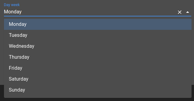
The options settings are:
Setting |
Usage |
Type |
Default value |
|---|---|---|---|
dayDelta |
When the start of the week occurs (-1 starts on Sunday) |
number |
0 |
To use this component, define the ui element with type WeekDaySelector:
{
  "type": "WeekDaySelector",
  "scope": "#/properties/dayWeek",
  "label": "Day",
  "options": {
    "dayDelta": 0
  }
}
Time selector
This component is the same one used to select the open or close hour in the Open/Close week scheduler. Returns the given hour as a string like ‘00:00’.
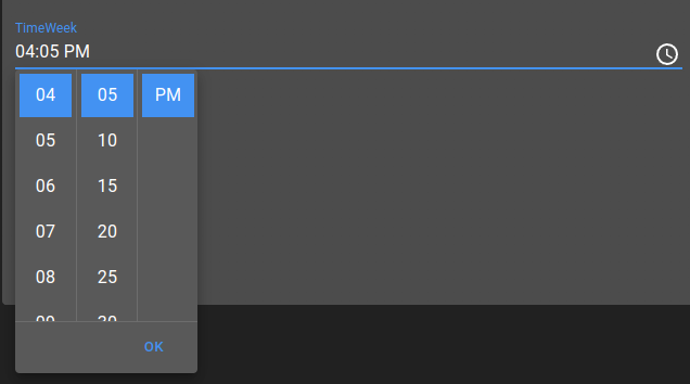
This component doesn’t have any options.
To use this component, define the ui element with type WeekTimeSelector:
{
  "type": "WeekTimeSelector",
  "scope": "#/properties/timeWeek",
  "label": "Time"
}
Filters builder
This component allows to build a filter, using AND and OR operations to combine multiple filters and create a more complex one. The main goal of this component is to be able to define a filter in a collection and use that collection in a JS or Lua script to check if a given alarm or collection element match the filter.
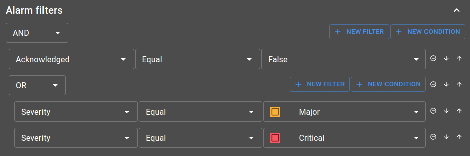
Those filters are either based on a alarm or a collection view, defining the fields that you can pick from when describing the filter.
To either work with alarms or collection, you can choose from two component:
AlarmsFilterBuilderCollectionsFilterBuilder
Both component need to have a view provided by them, but they don’t expect the exact same thing:
AlarmsFilterBuilder: setviewin options with an alarm view.web id.CollectionsFilterBuilder: setviewin options with a collection view id, referenced in the schema.web file. Alongside the view, you need to specify theschemathat possess thatview.
Other options are available for both, such as open and allowClose that can determine the default behavior of the component collapse part.
A common example you should check out if you want to use this component is the Define alarms silencing rules with collections example, showing how to silence an alarm if it match at least one of the rules (filters) define in a collection.
Api service picker
Api service picker allow user to search data from an API service.
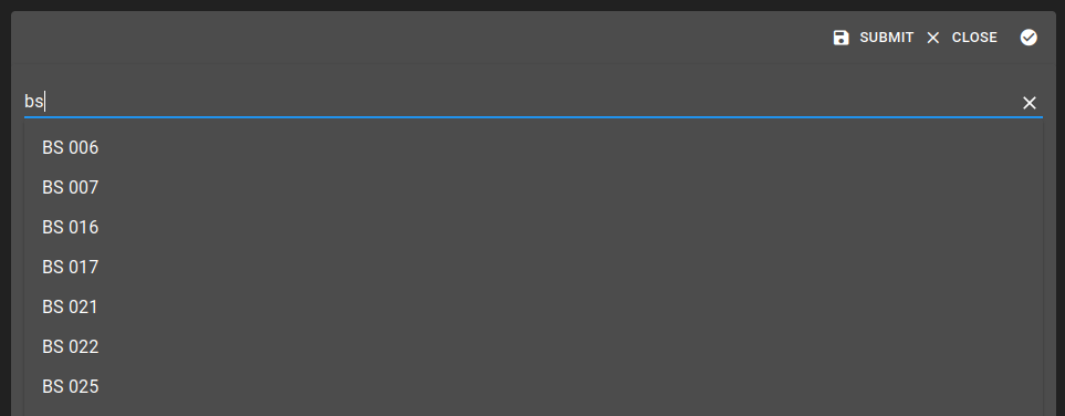
The options settings are:
Setting |
Usage |
Type |
Mandatory |
|---|---|---|---|
endpoint |
Api endpoint ID to use to get the data |
|
|
parameterField |
The parameter to set with the user input |
|
|
parameterBuilder |
A string representing the transformation to apply on the user input. The placeholder |
|
|
displayField |
The field from the retrieved data to use to show the available choice |
|
|
dataPath |
The JsonPath of the data to extract and use as the result |
|
|
timeout |
Override the default timeout define on the API service |
|
|
debounce |
Set the debounce time in millisecond for the user input to avoid create useless request. The default is 100 ms. |
|
|
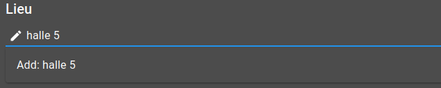
allowCreation |
Define if the user can add or edit data manually. This will not inject data to the underlying API. |
|
|
creationForm |
If the data is an object, the expected value is ItemId of the form to use otherwise it is not necessary. |
|
|

Status (stepper)
Status displays the current value of a property as a step within a horizontal stepper. The steps are taken from the enum of the bound property’s schema, and the active step is the one matching the current value.

This component doesn’t have any options. The bound property must define an enum:
{
  "status": {
    "type": "string",
    "enum": ["Draft", "In progress", "Done"]
  }
}
To use this component, define the ui element with type Status:
{
  "type": "Status",
  "scope": "#/properties/status",
  "label": "Status"
}
Tree select
Tree select allows the user to pick a value from a hierarchical tree. Each node exposes a name and can contain children nodes. Upon selection, the component stores the selected node as an object containing its id and name.
This component doesn’t have any options. The bound property holds the selected node, and the tree data follows this structure:
{
  "name": "Some value",
  "id": "1",
  "nodes": [{
    "name": "Some children",
    "id": "1.1",
    "nodes": []
  }]
}
To use this component, define the ui element with type TreeSelect:
{
  "type": "TreeSelect",
  "scope": "#/properties/category",
  "label": "Category"
}
User attributes
User attributes displays an editable key/value table, meant to store a free list of attributes. It is typically used to manage the custom attributes of a user.

This component doesn’t have any options.
Usage:
{
  "type": "UserAttributes",
  "scope": "#/properties/attributes",
  "label": "Attributes"
}
Debug
Debug displays a read-only text field containing the JSON representation of the bound data, with a button to copy it to the clipboard. It is useful while building a form, to inspect the data currently held by a given property.

This component doesn’t have any options.
Usage:
{
  "type": "Debug",
  "scope": "#/properties/data",
  "label": "Debug"
}
Json
Json displays a read-only, collapsible JSON view of the bound data, using the same viewer as the Json widget. It is useful to show a structured value inside a form without letting the user edit it.
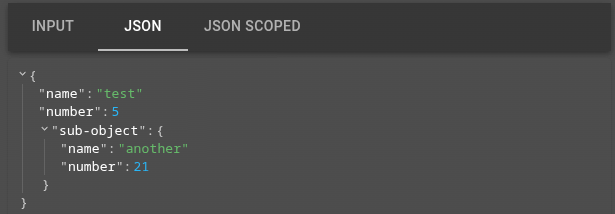
When a scope is provided, the component displays the value of that property. When scope is omitted, it displays the whole form data.
The options settings are:
Setting |
Usage |
Type |
Default value |
|---|---|---|---|
display |
Viewer display options ( |
|
|
style |
Viewer appearance, as a map of CSS variables with optional |
|
Usage:
{
  "type": "Json",
  "label": "JSON sub object",
  "scope": "#/properties/sub-object",
  "options": {
    "display": {
      "displayObjectSize": true
    }
  }
}
Layout elements
Layout elements allow elements organization. They are described in the following documentation.
Spacer
Spacer inserts an empty space in the layout, useful to align or separate elements. It doesn’t require a scope.

The options settings are:
Setting |
Usage |
Type |
Default value |
|---|---|---|---|
width |
Width of the empty space. |
CSS width |
|
height |
Height of the empty space. |
CSS height |
|
Usage:
{
  "type": "Spacer",
  "options": {
    "width": "50px",
    "height": "100%"
  }
}
List with detail
List with detail renders an array of objects as a master/detail layout: a list of the entries on the left, and the form of the selected entry on the right. It must be bound to an array property.
The options settings are:
Setting |
Usage |
Type |
Default value |
|---|---|---|---|
elementLabelProp |
Name of the property used to label each entry in the master list. |
|
|
disableAdd |
Disable the button to add a new entry. |
|
|
disableRemove |
Disable the button to remove an entry. |
|
|
Usage:
{
  "type": "ListWithDetail",
  "scope": "#/properties/entries",
  "label": "Entries",
  "options": {
    "elementLabelProp": "name"
  }
}
Toolbar
Setting a toolbar of type Form will display a form Select as well as a form Submit widget.
Select
Form select allows the user to select which Form to display.
Submit
Form submit allows the user to send Form to interact with OnSphere.