Map
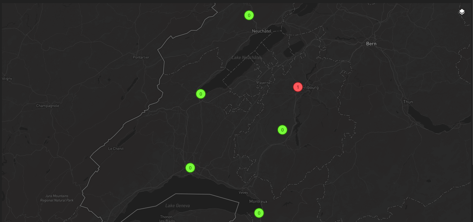
The Map widget displays configured geographical layers on an interactive map. It renders the GeoJSON produced by Geographical aggregation, including static geo.maps data and streamed collection-backed and alarm-backed layers, and can also overlay WMS and WMTS raster sources.
Capabilities
Capability |
Support |
Comment |
|---|---|---|
Use online map tiles |
|
Supported with Mapbox tiles (requires a dedicated API token). |
Use offline map tiles |
|
Supported with the Protomaps format for offline access. |
Use satellite view |
|
Supported only with a dedicated Mapbox style (using Mapbox Studio). |
Update base map style |
|
Supported through widget library settings. See Mapbox. |
Display static value-linked layers on a map |
|
The widget renders configured OnSphere layers produced by Geographical aggregation. See Layer controls and user-facing filters. |
Display static alarm-linked layers on a map |
|
The widget renders configured OnSphere layers produced by Geographical aggregation. See Layer controls and user-facing filters. |
Display collection-backed geographical layers on a map |
|
COLLECTIONS layers are rendered through the same map request contract. See Layer controls and user-facing filters. |
Display alarm-backed geographical layers on a map |
|
ALARMS layers are rendered through the same map request contract. See Layer controls and user-facing filters. |
Display static or dynamic icons on a map |
|
Point icons are configured in Geographical aggregation and loaded by the widget. See Icons. |
Configure point and polygon colors per feature |
|
Point and polygon colors are read from feature properties with a default fallback, for static, collection-backed, and alarm-backed STANDARD layers. See How feature colors are resolved. |
Color severity layers automatically from alarm severity |
|
SEVERITY layers are colored from the configured severity palette instead of per-feature properties. See How feature colors are resolved. |
Points aggregation (clustering) |
|
Standard and severity point layers can expose clustering options. See Layer controls and user-facing filters. |
Show or hide configured OnSphere layers |
|
The layer menu can toggle any configured layer. See Layer controls and user-facing filters. |
Hide the layer menu through configuration |
|
Set |
Navigate to a dashboard from a displayed map element |
|
Use the GeoJSON |
Load SVG as an map icon |
|
|
Limit map boundaries and movements |
|
Configure center, zoom, pitch, bearing, |
Switch dynamic collection filters from the map |
|
The layer menu exposes collection filter ids when a visible layer declares more than one. See Collection and alarm filters. |
Switch dynamic alarm filters from the map |
|
The layer menu exposes alarm filter ids when a visible layer declares more than one. See Collection and alarm filters. |
Notify when a selected filter returns no points |
|
Selecting a collection or alarm filter with an empty result shows a notification without locking the layer. See Collection and alarm filters. |
Reuse one floor selector across OnSphere, WMTS, and WMS layers |
|
Use |
WMTS layer support |
|
Overlay external WMTS raster tiles with templated URLs and runtime parameters. See External raster overlays and parameters. |
WMS image support |
|
Display WMS |
Toggle WMS and WMTS sources at runtime |
|
Each configured external source appears in the layer menu and can be shown or hidden independently. See Runtime source toggles. |
WMS / WMTS static parameter settings |
|
Inject fixed placeholder values into WMS and WMTS templates. See WMS / WMTS template parameters (Static, Dynamic, Shared). |
WMS / WMTS dynamic parameter settings |
|
Expose |
WMS / WMTS shared parameter settings |
|
Reuse one selector value across several WMS and WMTS sources. See WMS / WMTS template parameters (Static, Dynamic, Shared). |
Open map menu actions from right click or long press |
|
Map menus can use the clicked position and feature context. See Map context and Create alarm from map context menu. |
Read clicked coordinates, layers, and features in menu context |
|
The map menu context exposes |
Navigate to a specific location on the map from a menu or widget |
|
Use |
Activate or deactivate a specific layer from a menu or widget |
|
Use |
Link to the current map location through the URL |
|
The widget synchronizes the |
Use street view |
|
|
Update element location on the map |
|
|
Read live mouse-pointer coordinates |
|
|
Include the map in a menu (for example as a position picker) |
|
|
Draw shapes or query an area on the map |
|
|
Search, measure distance or area, or calculate itineraries |
|
|
Export the current map view as an image or PDF |
|
|
Use tiled WMS sources |
|
|
Use external vector, WFS, or GeoJSON overlay sources |
|
|
Adapt WMS or WMTS language and theme automatically from the OnSphere theme |
|
|
Configure WMS or WMTS layers automatically from |
|



Module capabilities
Capability |
Support |
Comment |
|---|---|---|
Display static value-linked layers |
|
|
Display static alarm-linked layers |
|
|
Display collection-backed geographical layers |
|
|
Display alarm-backed geographical layers |
|
|
Display static or dynamic icons |
|
See Icons |
Support GeoJSON Point, LineString, and Polygon |
|
See GeoJSON support |
Use reserved GeoJSON properties on map features |
|
|
Set per-feature colors on points and polygons |
|
Use |
Color severity layers automatically from severity |
|
SEVERITY layers derive colors from the alarm severity palette; per-feature color properties are ignored. See How feature colors are resolved. |
Set per-feature colors on lines |
|
LineString features use a fixed color and width. See Limitations. |
Declare STANDARD, SEVERITY, and ICON layers |
|
|
Populate layers from STATIC sources |
|
|
Populate layers from COLLECTIONS sources |
|
|
Populate layers from ALARMS sources |
|
|
Inherit static GeoJSON hierarchically from |
|
|
Mix different geometry types inside one layer |
|
See Limitations |
Support GeoJSON polygons with holes |
|
See Limitations |
Geocoding and reverse geocoding to translate between addresses and coordinates |
|
See Limitations |
Expose geographical information through an API |
|
See Limitations |
List of configuration files
Filename |
Short description |
Format |
Link to documentation |
|---|---|---|---|
dashboard.view#MapsWidget |
Defines the MapsWidget widget global settings. |
json |
List of examples
Short description |
Link to documentation |
|---|---|
Display static value-linked layers |
|
Display static alarm-linked layers |
|
Display collection-backed layers |
|
Display alarm-backed layers |
|
Display static and dynamic icons |
|
Use offline MapLibre and Protomaps |
|
Overlay WMTS sources |
|
Overlay WMS image sources |
|
Reuse shared WMS and WMTS parameters |
|
Reuse one floor selector across OnSphere, WMTS, and WMS layers |
|
Use map context methods and clicked feature context |
|
Trigger map menu actions from a clicked position |
Basemap libraries and required settings
The widget renders one basemap library per widget instance. On top of that basemap, it can display configured OnSphere layers and optional WMS or WMTS raster overlays.
Mapbox
Mapbox is the online basemap option. When the widget uses Mapbox:
mapStyleis required and defines the light and dark styles used by the widgeta valid Mapbox access token is required to load the base tiles
satellite views and other custom base styles come from Mapbox styles, for example through Mapbox Studio
Get an API token
Get a Mapbox account. Then connect to the Mapbox console and get a token following Access Tokens documentation. Usually you can copy the one shown on the access token page.
The key format is similar to pk.eyXXXXXXXXXXXXXXXXXXXXXXXXXXXXXXXXXXXXXXXXX.YYYYYYYYYYYY.
MapLibre and Protomaps
MapLibre is the offline or self-hosted basemap option. When the widget uses MapLibre:
protomapSourceis requiredthe source can be an
osp-webresource path or a remote HTTPS URLthe server hosting the PMTiles archive must support HTTP range requests
Protomaps stores map tiles as a single file, which makes it suitable for offline or controlled-network deployments. For an end-to-end example, see Offline map display standard points on map.
Icon image formats
Map icon assets configured through mapsWidgetSettings.icons are loaded at runtime by the map library. Use raster image files only: .png, .jpg, .jpeg, or .webp.
.svg files are not supported directly for these runtime map icons in either Mapbox or MapLibre. Convert SVG icons to one of the supported raster formats before referencing them from Dashboard view and module.resources.
Layer controls and user-facing filters
The widget always requests selected layer ids through the maps websocket using the same request-maps-layer contract. Static geo.maps layers, COLLECTIONS layers, and ALARMS layers all reuse that request. mapsWidgetSettings.layerOptions decides which OnSphere layers can be displayed by the widget.
The layer menu lets the user show or hide any configured OnSphere layer. For point layers, clustering is defined in the layer configuration and rendered by the widget when the layer is active.
The same layer mechanism also enables click navigation through the GeoJSON linkedDashboard property. When an ICON layer is used, the widget must also load the corresponding icon assets from Dashboard view and module.resources.
Point and polygon colors are set per feature (for static, collection-backed, and alarm-backed STANDARD layers), while SEVERITY layers are colored automatically from the alarm severity. See How feature colors are resolved.
The whole layer menu can be hidden with mapsWidgetSettings.displayLayersMenu. It defaults to true. Set it to false to remove the layer button and its menu, for example on dashboards where layer visibility and filters must stay fixed. Hiding the menu removes the OnSphere layer toggles, the dynamic collection and alarm filter selectors, and the WMS and WMTS source toggles. It does not change which layers are requested or rendered, and the floor picker and other Select parameter selectors remain available because they are separate controls.
Collection and alarm filters
When a visible COLLECTIONS layer declares more than one filter id, the layer menu exposes those filters and lets the user switch between them. The same applies to ALARMS layers that declare more than one alarm filter id.
The widget tracks at most one active dynamic filter per OnSphere map layer:
for COLLECTIONS sources, the selected id is sent as
dynamicCollectionFilters[layerId]for ALARMS sources, the selected id is sent as
dynamicAlarmFilters[layerId]
Changing one of those menu entries updates the next maps websocket request for the affected layer only. It does not modify any other OnSphere layer, does not synchronize other widgets such as CollectionTable or AlarmTable, and does not introduce any widget-side view concept for COLLECTIONS.
For ALARMS layers, the source view stays the one declared in layer.ospp. The widget only changes the active filter id for that layer and never switches the underlying alarm view.
When a selected collection or alarm filter returns no point for that layer, the widget keeps the filter selector usable and shows a short notification instead of locking the layer. The layer is never disabled by an empty result, so you can immediately switch back to another filter or to a filter that does have points. The notification is shown only when a filter selection is changed and the resulting data is empty; it is not raised on the initial load nor when switching to a filter that does have points.
Floor-linked filtering
One floor selector can drive both external raster sources and OnSphere layers.
Use style: "Floor" on a Select or Shared parameter to create the floor selector. Then, for each OnSphere layer that must react to that floor, add floorPropertyPath on the corresponding mapsWidgetSettings.layerOptions entry.
The path is resolved against the final GeoJSON properties object emitted for that layer, so values such as floor, additionalData.floor, or map.floor can be matched against the selected floor. Layers without floorPropertyPath are not affected.
The selected floor is carried in the url, so a link can open a dashboard directly on a given floor. See Floor parameter.
Warning
Only one style: "Floor" parameter is supported per widget.
Note
The map menu context does not expose the currently selected floor value. If a menu action needs that value, ask for it explicitly or derive it from your own configuration flow.
External raster overlays and parameters
WMTS sources
The widget can overlay WMTS raster layers on both Mapbox and MapLibre maps. Add them inside mapsWidgetSettings.wmtsSources.
Build the
urlTemplatewith standard{z}/{x}/{y}coordinates and optional custom${placeholder}parts.Describe each placeholder in
urlRequestParameters.sourceNameidentifies the source in the map and in the layer menu.formatandtileSizemust match the WMTS server configuration.
Warning
Adding many WMTS sources or heavy layers can impact performance because each source triggers additional tile requests.
Linked examples
WMS image sources
The widget can overlay WMS GetMap responses on both Mapbox and MapLibre maps. Add them inside mapsWidgetSettings.wmsSources.
Build the
urlTemplateas a standard WMS request with optional custom${placeholder}parts.Describe each placeholder in
urlRequestParameters.sourceNameidentifies the source in the map and in the layer menu.formatandtileSizemust match the WMS server configuration if you substitute them in the template.
WMS support is image-based, not tile-based. The widget always overrides BBOX, WIDTH, and HEIGHT in the query string to match the current viewport in Web Mercator (EPSG:3857).
Warning
Adding many WMS sources or requesting large bounding boxes can impact performance because each source triggers additional HTTP requests.
Linked examples
Runtime source toggles
Each configured WMS or WMTS source appears in the layer menu under the external section. Users can show or hide those sources independently at runtime without changing the dashboard configuration.
Warning
OnSphere layers always render above WMS and WMTS overlays. This can hide labels or information coming from the raster layer underneath.
URL state and context integration
URL parameters
This widget supports URL parameters. The available parameters are:
pos: map position, zoom, pitch, and bearingfloor: floor currently selected in the floor picker
The pos format is encoded as follows, with decimal points written as , and each part separated by ;:
nfor longitudeafor latitudezfor zoombfor bearingpfor pitch
For example, a valid value is pos=n7,135696;a46,808249;z15,21.
The widget keeps pos and floor synchronized with the map as the user moves it.
Set disableUrlHistory to true in the widget settings to stop this widget reading and writing these parameters. See Disabling the parameters.
Floor parameter
When the widget declares a style: "Floor" parameter, as described in Floor-linked filtering, the selected floor is also carried in the url. A link such as https://<host>/<dashboard-id>#<widget-id>.floor=Niveau%202 opens the dashboard directly on that floor, with the floor picker, the floor-filtered OnSphere layers, and the WMS and WMTS templates already aligned on it.
The value is the value of the floor option declared in the parameter options, url-encoded. A value containing spaces or accents must therefore be escaped, for example Niveau%202 for the floor Niveau 2.
The floors are a closed list, so the widget only accepts a floor it knows:
on load, the floor read from the url is applied when it matches one of the declared options
when it matches none of them, is empty, or carries a malformed escape sequence, it is ignored and the parameter
defaultValueis used instead. When that default is itself not part of the declared options, the first option is usedthe widget keeps following the fragment while it stays mounted, so opening a link pointing to another floor of a dashboard already displayed switches the floor without a reload
Changing the floor, from the picker or through the navigateOnMap context method, updates the url and adds a browser history entry, so the back button returns to the previously selected floor. Writing the fragment for the first time does not add a history entry, because establishing the initial floor is not a floor change.
Since the fragment is prefixed by the widget id, each map widget of a dashboard carries its own floor.
Map context
Warning
 This feature is currently in beta. It may change in a future version without prior notice. See the Beta Features page for the full list of beta features and their planned release. If you’re using this feature, we encourage you to share your feedback to help with the evaluation process.
Warning
These methods are only available to widgets and menus on the same dashboard.
The widget exposes the following context helpers. Each one performs an action on the map widget and returns nothing, so they are called for their side effects. They are reached through the widget osp context described below.
Function |
Parameters |
Output / result |
|---|---|---|
|
|
Runs a short fly-to animation to the requested camera position, applying |
|
|
Shows the layer, as if the user enabled it in the layer menu. Has no effect if the layer is not configured for this widget, or if it currently holds no loaded data. |
|
|
Hides the layer. Unlike |
|
|
Selects the active collection filter for that layer, like the menu selector in Collection and alarm filters. Affects only that layer’s next maps request. |
|
|
Selects the active alarm filter for that layer, with the same per-layer behavior. The underlying alarm |
Linked examples
Limitations and non-supported features
The widget currently does not support the following:
street view
updating the location of an existing element directly on the map
reading live mouse-pointer coordinates outside of menu click context
embedding the map as a position picker inside a menu
drawing shapes to query a zone
map search, distance or area measurement, and itinerary calculation
exporting the current map view as an image or PDF
tiled WMS support
external vector, WFS, or GeoJSON overlay sources
automatic WMS or WMTS setup through
GetCapabilitiesautomatic WMS or WMTS language or theme adaptation from the OnSphere theme