Schematic
List of configuration files
Filename |
Short description |
Format |
Link to documentation |
|---|---|---|---|
dashboard.view#SchematicWidget |
Defines the SchematicWidget widget global settings |
json |
Capabilities for advanced editing
Capabilities |
Support front-end |
Support composer |
Comment |
|---|---|---|---|
Standard mxgraph library with existing shape can be imported statically (no update propagation). |
|
|
The content of model is copied inside the schematic. |
New shape can be created and imported from a standard xml format. |
|
|
This is expected to be added in the future. |
New shape can be created and imported from a standard js format. These shape can include a state managed and change base on a value. |
|
|
This is expected to be added in the future. |
Standard mxgraph library with existing shape can be imported dynamically (update propagation). |
|
|
This is expected to be added in the future. |


Widget
Schematic widgets let the user draw shapes and show interaction with values from OnSphere.
The rendering engine is done using MxGraph.
To create a schematic in the configuration, we use Visual Studio Code with Draw.io Integration.
First, create a file with “.drawio” extension, then open it with Visual Studio Code.
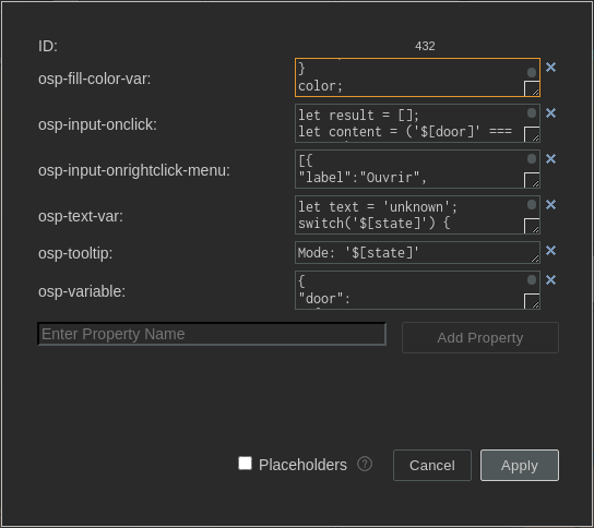
All bindings/interactions can be added on shapes/stencils through the Edit data menu (or Ctrl + M when selecting a shape)
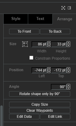
Each bindings/interactions must be added on its own as shown in the figure below.
Stylesheet and theme
The default styles applied to the diagram can be replaced with the stylesheet setting, holding the path to an mxStylesheet XML file. Without it, or when the file cannot be parsed, the built-in stylesheet is used.
schema and stylesheet both accept a dark/light object instead of a single path, so a schematic can follow the active theme. See the dynamic colors example.
Bindings
The following bindings are available:
osp-text(expect a string) which allows updating cells text valueosp-state(expect a JSON object or string containing JSON object) which allows updating several cell properties at once, see State bindingosp-state-visible(expect a boolean) which allows updating cells visibilityosp-fill-color(expect a CSS color) which allows updating cells fill colorosp-fill-opacity(expect an integer between 0 and 100) which allows updating cells fill opacityosp-stroke-opacity(expect an integer between 0 and 100) which allows updating cells stroke opacityosp-opacity(expect an integer between 0 and 100) which allows updating cells opacityosp-border-color(expect a CSS color) which allows updating border colorosp-font-color(expect a CSS color) which allows updating cells font color
osp-text-var and osp-fill-color-var are accepted as aliases of osp-text and osp-fill-color. They exist for schematics produced by earlier tooling and behave identically.
Whatever is put the binding will be evaluated. When the last part evaluated is a statement, the value will change the binding.
For example:
osp-text: let text = 'unknown';
switch('${root.office.door.state.mode}') {
case 'LOCKED':
text = 'Locked';
break;
case 'UNLOCKED':
text = 'Unlocked';
break;
}
text;
osp-fill-color: let color = '#6da7ff';
switch('${root.office.door.state.mode}') {
case 'LOCKED':
color = '#61c05e';
break;
case 'UNLOCKED':
color = '#ff3200';
break;
}
color;
Evaluation
A binding holding at least one ${...} reference is evaluated again each time one of the referenced values changes. A binding holding none is evaluated once, when the schematic is loaded, which is how a style computed from the context alone is applied.
The context of a binding is not the one of an interaction. Only the following entries are available:
osp.user, see Userosp.alarmSeverity(number), also available asosp.alarmBySeverity(number)osp.alarmSeverityId(id)
Operations such as osp.send or osp.setLayer belong to interactions and do nothing in a binding.
osp-text has two behaviours the other bindings do not have:
When the evaluation returns nothing, the expression is evaluated again as a plain string. A label can therefore be written as text with placeholders, without any JavaScript, such as
Temperature: ${root.office.sensor.temperature} °C.When one of the referenced values is unavailable, the label declared in the
.drawiofile is restored instead of an empty text.
State binding
The osp-state binding drives the whole state of a cell from a single value, instead of declaring one binding per property.
It expects either a JSON object or a string containing JSON object. Any other value, as well as a string that cannot be parsed, is ignored and leaves the cell untouched.
Each key of the object is applied to the cell as follows:
Key |
Usage |
Type |
|---|---|---|
visible |
Shows or hides the cell. |
boolean |
text |
Replaces the cell label. |
string |
x, y |
Moves the cell. |
number |
width, height |
Resizes the cell. |
number |
image |
Replaces the cell image. A |
string |
any other key |
Applied as an mxGraph style, such as |
string |
All the keys of a single evaluation are applied in one graph update, so the cell is repainted once no matter how many properties change.
A null value is skipped, which allows an expression to leave a property untouched without having to rebuild the whole object.
Note
osp-state-visible remains available and is more convenient when visibility is the only property to update.
Example:
osp-state: let state = {'visible': true, 'text': 'unknown', 'fillColor': '#6da7ff'};
switch('${root.office.door.state.mode}') {
case 'LOCKED':
state.text = 'Locked';
state.fillColor = '#61c05e';
break;
case 'UNLOCKED':
state.text = 'Unlocked';
state.fillColor = '#ff3200';
break;
}
state;
Conversion
Instead of a literal, a key can hold a conversion object, which maps a content to one of several possible values. This allows the mapping to be described as data rather than as branching code.
Both fields are required, otherwise the key is skipped.
Field |
Usage |
Type |
|---|---|---|
content |
The key to look up in |
string |
conversion |
The map of possible contents to the value to apply. |
object |
Example, applying a fill color and a label from the same value:
osp-state: ({
'fillColor': {
'content': '${root.office.door.state.mode}',
'conversion': {'LOCKED': '#61c05e', 'UNLOCKED': '#ff3200'}
},
'text': {
'content': '${root.office.door.state.mode}',
'conversion': {'LOCKED': 'Locked', 'UNLOCKED': 'Unlocked'}
}
});
Interactions
The following interactions are available:
osp-input-onclickwhich reacts to left clickosp-input-onrightclickwhich reacts to right clickosp-tooltipwhich reacts to mouse hoverosp-input-onclick-menuwhich reacts to left click menuosp-input-onrightclick-menuwhich reacts to right click menu
For touch interaction, following mapping is done:
osp-input-onclickis mapped to the touch eventosp-input-onrightclick-menuis mapped to the tap and hold event
For example:
osp-input-onclick: let result = [];
let content = ('${root.office.door.control.lock}' === 'true') ? false : true;
result.push({id:'root.office.door.control.lock', content:content});
osp.send(result);
The value of osp-input-onclick-menu and osp-input-onrightclick-menu is an expression evaluating to the array of menu items to display:
[
  {
    "label": "Open",
    "icon": "timer",
    "command": "osp.send({id:'root.office.door.control.action', content:'open'});"
  },
  {
    "label": "Lock",
    "icon": "lock",
    "command": "osp.send({id:'root.office.door.control.action', content:'lock'});"
  },
  {
    "label": "Unlock",
    "icon": "lock_open",
    "command": "osp.send({id:'root.office.door.control.action', content:'unlock'});"
  }
]
Menu format is:
{
type ShowDynamicMenuType = {
    label: string,
    icon?: string,
    command?: string,
    confirmation?: {
        message?: string,
        acceptLabel?: string,
        cancelLabel?: string
    },
    closeAfterInteraction?: boolean
}
When confirmation object is present, it will prompt the user with a dialog window.
Context
When evaluating interaction, it is possible to use the context to update value and schematic.
The context contains the following methods to interact with:
osp.widgets(id): to access any widget available in current dashboard using widgetid. This will allow access to widget exposed features.osp.navigate(path), also available asosp.navigateTo(path), to navigate to any dashboard see Navigation from widget contextosp.evaluate(code): to allow menucodeinteraction evaluation (see dynamic evaluation)osp.send(jsonMessage)to update a value or an array of value with their respective contentjsonMessageosp.moveTo(id, options)to move schematic camera to a cellidin current schematic with optional options.osp.setLayer(id, flag)to set/unset layeridas shown/hiddenflagosp.toggleLayer(id)to toggle layeridvisibility (show and hide) depending on its current stateosp.setPage(id)to set update current schematic pageidosp.alarmSeverity(number)to retrieve alarm severity for givennumber, also available asosp.alarmBySeverity(number)osp.alarmSeverityId(id)to retrieve alarm severity for givenid(i.e.root.alarms.severities.clear)osp.userholding the profile of the current user, see User
Note
osp-tooltip is evaluated without this context. A tooltip can hold ${...} references but no osp. operation.
Example:
[
  {
    "label": "Display interactions",
    "icon": "visibility",
    "command": "osp.setLayer('321', true);",
    "confirmation": {}
  },
  {
    "label": "Hide interactions",
    "icon": "visibility_off",
    "command": "osp.setLayer('321', false);",
    "confirmation": {}
  },
  {
    "label": "Goto hotspot",
    "icon": "local_cafe",
    "command": "osp.moveTo('349');",
    "confirmation": {}
  },
  {
    "label": "Goto tech",
    "icon": "build",
    "command": "osp.moveTo('351', {'maxScale': 16});",
    "confirmation": {}
  }
]
Move to options
Move to options used by osp.moveTo have the following fields:
Field |
Usage |
Type |
|---|---|---|
disableScale |
Whether to disable scaling or not (default = |
boolean |
minScale |
Minimum scale accepted by |
number |
maxScale |
Maximum scale accepted by |
number |
Both fields are optional.
The value to pass to minScale and maxScale can be extrapolated with the drawio plugin by dividing the zoom displayed in the toolbar by 100. For example, when the value shows 1075, the scale to give is 10.75 (1075 / 100 = 10.75).
Alarm severity
Alarm severity object returned by osp.alarmSeverity and osp.alarmSeverityId has the following fields:
Field |
Usage |
Type |
|---|---|---|
id |
Alarm severity ID |
string |
name |
Alarm severity name |
string |
description |
Alarm severity description |
string |
fallback |
Whether the alarm severity is by default or not |
boolean |
severity |
The alarm severity level |
number |
fgColor |
Alarm severity foreground color |
string |
bgColor |
Alarm severity background color |
string |
fgHiColor |
Acknowledged alarm severity foreground color |
string |
bgHiColor |
Acknowledged alarm severity background color |
string |
osp.alarmSeverity accepts a severity level as a number or as a string, a severity identifier, a severity object, or an array of severity objects, in which case the most severe one is returned. It always returns an object, falling back to a colorless one when nothing matches.
osp.alarmSeverityId returns undefined when no severity carries the given identifier.
User
osp.user holds the Keycloak profile of the user looking at the schematic. It is available in interactions as well as in bindings.
osp-text: osp.user.firstName + ' ' + osp.user.lastName;
The same profile is also reachable as a value reference with ${osp.user}, which is replaced by the profile serialized as JSON:
osp-text: let user = ${osp.user};
user.username;
Both forms hold the fields returned by Keycloak:
{
  "id": "<user id>",
  "username": "<username>",
  "email": "<user email>",
  "firstName": "<first name>",
  "lastName": "<last name>",
  "emailVerified": true,
  "attributes": {
    "<keys>": ["values"]
  }
}
attributes is only present on osp.user. The ${osp.user} form leaves it out, along with the profile metadata of Keycloak.
Note
${osp.user} is resolved as a value reference, so the schematic subscribes to an osp.user identifier which does not exist on the stack. The subscription is harmless but useless, which makes osp.user the form to prefer.
Widget context
The schematic exposes its operations to the rest of the dashboard through osp.widgets(id), id being the identifier of the schematic widget. Another widget, a menu or a toolbar can therefore drive the schematic:
osp.widgets('schematic-1').setPage('page-2');
osp.widgets('schematic-1').moveTo('351', {'maxScale': 16});
The operations available this way are the ones of the interaction context: send, evaluate, moveTo, setLayer, toggleLayer, setPage, navigate, navigateTo, alarmSeverity, alarmBySeverity, alarmSeverityId and user.
Labels
Labels display is depend on how integrator chooses it to be displayed. By default a label has the following settings active (visible in Text tab in draw.io) :
Word Wrap: whether the label wraps in the shape or notFormatted Text: whether to handle text as HTML label
For more information on these settings, see https://www.drawio.com/doc/faq/line-breaks.
To disable handling labels as HTML, either remove the checkbox for both Word Wrap and Formatted Text or use disableLabelAsHtmlDetection settings in Schematic widget settings.
Variables
It is possible to declare, for each shape, a JSON object which contains fixed variables with osp-variable property. You can use declared variables in each interaction and binding.
To access the variable content, use $[variable_name].
They are evaluated at schematic initialization.
Variables can also be declared for the whole widget, with the variables setting. Both sets are merged, a variable declared on a shape taking precedence over the widget one.
Example
{
"door": "${root.office.door.control.lock}",
"door-write": "root.office.door.control.lock",
"state": "${root.office.door.state.mode}",
"action-write": "root.office.door.state.action"
}
osp-input-onclick:
let result = [];
let content = ('$[door]' === 'true') ? false : true;
result.push({id:'$[door-write]', content:content});
osp.send(result);
osp-fill-color:
let color = '#6da7ff';
switch('$[state]') {
case 'LOCKED':
color = '#61c05e';
break;
case 'UNLOCKED':
color = '#ff3200';
break;
}
color;
Local storage
When local storage is activated, the following parameters are stored:
Schematic position
Schematic zoom level
Schematic active page
URL parameters
This widget handle URL parameters. These are the available parameters:
diagram: change the active page
Set disableUrlHistory to true in the widget settings to stop this widget reading and writing these parameters. See Disabling the parameters.
Null values
When a value.ospp holds a null value, the system returns undefined. This behavior is consistent across all supported data types:
TEXT
DECIMAL
INTEGER
BOOLEAN
In other words, a null value is not type-specific and is always mapped to undefined.