JSON
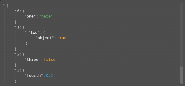
The JSON widget displays a JSON value on a dashboard using a theme-aware, collapsible tree viewer with syntax highlighting and an optional clipboard copy. Any JSON type is accepted: object, array or scalar.
The same viewer is reused across the front-end: in table cells, in form components and in menu outputs. The display and appearance options documented here are shared by all of them.
List of configuration files
Filename |
Short description |
Format |
Link to documentation |
|---|---|---|---|
dashboard.view#JsonWidget |
Defines the Json widget global settings |
json |
List of examples
Short description |
Link to documentation |
|---|---|
Display a JSON value and update it from a menu |
Concept
A Json widget is configured through jsonWidgetSettings:
content: the JSON value to display. Any JSON type is accepted (object, array or scalar). Defaults to an empty object. The value can be replaced at runtime through the widget setJson action.options: the viewer display options (see Display options).style: the viewer appearance (see Appearance).
The displayed content can come from three sources: the static content above, the runtime setJson action, or subscribed values. Whatever the source, the content is normalized before display (escaped JSON is expanded and empty values become an empty object).
Usage:
{
  "type": "Json",
  "id": "my-json",
  "title": "Payload",
  "jsonWidgetSettings": {
    "content": {
      "name": "sensor-1",
      "enabled": true,
      "thresholds": [10, 20, 30]
    },
    "options": {
      "collapsed": false,
      "displayObjectSize": true
    }
  }
}
Displaying subscribed values
Instead of a static content, the widget can subscribe to OnSphere values through valueSubscriptions. As soon as at least one subscribed value is received, the widget replaces its content with an object keyed by each value id:
for a value that resolved correctly, the entry holds the value
content;for a value in error, the entry holds an
{"error": "<reason>"}object.
{
  "type": "Json",
  "id": "my-json",
  "title": "Subscribed values",
  "valueSubscriptions": {
    "values": [
      {"id": "root.some.value", "type": "TEXT"},
      {"id": "root.broken.value", "type": "TEXT"}
    ]
  }
}
With the configuration above, the widget displays:
{
  "root.some.value": "<content of root.some.value>",
  "root.broken.value": {"error": "<reason>"}
}
Subscribed values keep updating the displayed content whenever they change; a later setJson call replaces the whole content again.
Escaped and empty content
Whatever the content source, the viewer normalizes it before rendering:
Escaped JSON is expanded. A string that itself contains valid JSON — an object or an array, for example a value stored as an escaped JSON string — is parsed and rendered as structured JSON. This is applied recursively, at any depth, so nested escaped JSON is expanded as well.
Empty values become an empty object.
nullandundefinedare rendered as an empty object{}. Likewise, a top-level string that is not itself a JSON object or array is shown as{}rather than as raw text.
This normalization is shared by every surface that reuses the viewer: the widget, the table modal, the form component and the menu output.
Display options
The options object controls how the value is rendered. Every option is optional; the defaults below match the behavior of the shared viewer.
Setting |
Usage |
Type |
Default value |
|---|---|---|---|
keyName |
Define the root node name of the object. |
|
(empty) |
objectSortKeys |
Whether to sort object keys alphabetically. |
|
|
indentWidth |
Indent width, in pixels, for nested objects. |
|
|
displayObjectSize |
Whether |
|
|
displayDataTypes |
Whether data type labels prefix values. |
|
|
enableClipboard |
Whether the user can copy objects and arrays to the clipboard. |
|
|
collapsed |
When |
|
|
highlightUpdates |
Whether to highlight updated values. |
|
|
shortenTextAfterLength |
Shorten long JSON strings after this length; set to |
|
|
For the full and authoritative reference, see the JsonWidgetOptionsSettings schema.
Appearance
The style object customizes the viewer appearance as a map of CSS variable name to value, applied on top of the current theme. Values declared at the root of the object apply to both light and dark themes. Values declared under the optional light and dark keys only apply to the matching theme mode and take precedence over the root ones.
{
  "type": "Json",
  "id": "my-json",
  "jsonWidgetSettings": {
    "content": {},
    "style": {
      "--w-rjv-font-family": "monospace",
      "light": {
        "--w-rjv-type-string-color": "#1b5e20"
      },
      "dark": {
        "--w-rjv-type-string-color": "#81c784"
      }
    }
  }
}
The supported CSS variables are listed in the JsonWidgetSettings schema.
Widget context
The widget context gives access to this operation:
setJson(value): replace the JSON value currently displayed by the widget withvalue.
This lets a menu, a script or another widget update the displayed content at runtime. For example, from a menu evaluate output:
osp.widgets('my-json').setJson(${alarms.clicked})
Refer to Widgets contexts for more information on how widget contexts are accessed.