Dashboard layout
Hint
Layouts are widgets themselves, meaning that all widget-specific configurations can be applied to them.
Box Layout
Overview
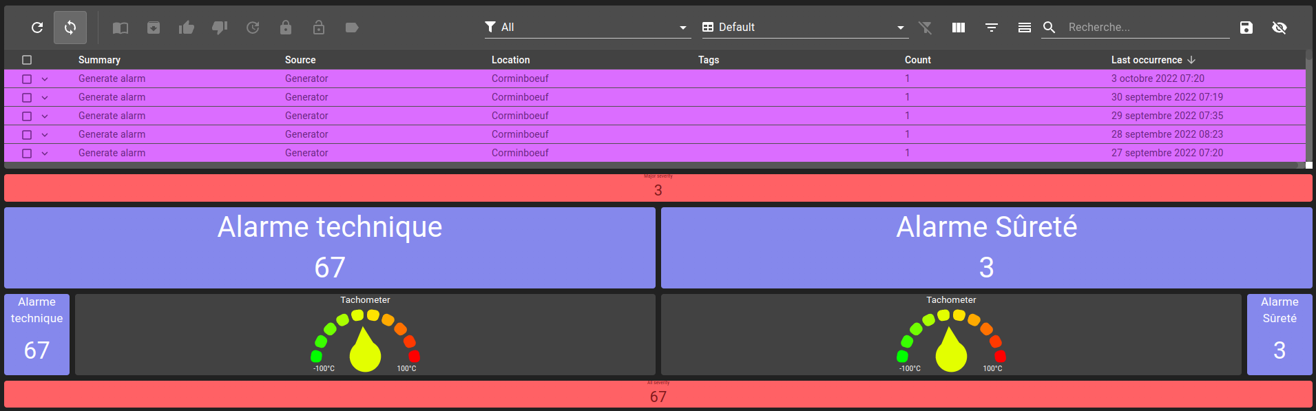
Box layouts allow you to dispose multiple widgets in a single one. The widgets are displayed vertically as a column or horizontally as a line in order they were defined. Layouts can be nested.
In this example, all widgets are within a box layout. Example of a box layout:
List of configuration files
Filename |
Short description |
Format |
Link to documentation |
|---|---|---|---|
dashboard.view#BoxLayoutWidget |
Defines the BoxLayoutWidget widget global settings |
json |
Usage
Following settings can be used to define a layout:
Setting |
Usage |
Type |
Default value |
orientation |
Box orientation (Horizontal or Vertical) |
Horizontal or Vertical |
Vertical |
components |
List of components to display in this box |
List of BoxLayoutComponent |
BoxLayoutComponent Settings
Following settings can be used to define a box layout component:
Setting |
Usage |
Type |
Default value |
component |
Widget |
Widget |
|
size |
Widget initial size (in percent). Needs to be set if sizeFactor is none |
0-1 |
0.1 |
sizeFactor |
Component size factor. grow makes the widget take as much space it can and shrink makes it take the least amount of space. |
grow, shrink or none |
none |
Example of a box layout widget:
{
    "type": "BoxLayout",
    "id": "",
    "title": "",
    "boxLayoutWidgetSettings": {
        "orientation": "Horizontal",
        "components": [
            {
                "component" : {
                    "type": "BasicInputOutputValue",
                    "id": "",
                    "title": "",
                    "valueSubscriptions": {
                        //...
                    },
                    "basicWidgetSettings": {
                        //...
                    },
                },
                "sizeFactor": "grow"
            },
            {
                "component": {
                    "type": "BasicInputOutputValue",
                    "id": "",
                    "title": "",
                    "valueSubscriptions": {
                        //...
                    },
                    "basicWidgetSettings": {
                        //...
                    },
                },
                "sizeFactor": "grow"
            }
        ]
    }
}
Border Layout
List of configuration files
Filename |
Short description |
Format |
Link to documentation |
|---|---|---|---|
dashboard.view#BorderLayoutWidget |
Defines the BorderLayoutWidget widget global settings |
json |
Features
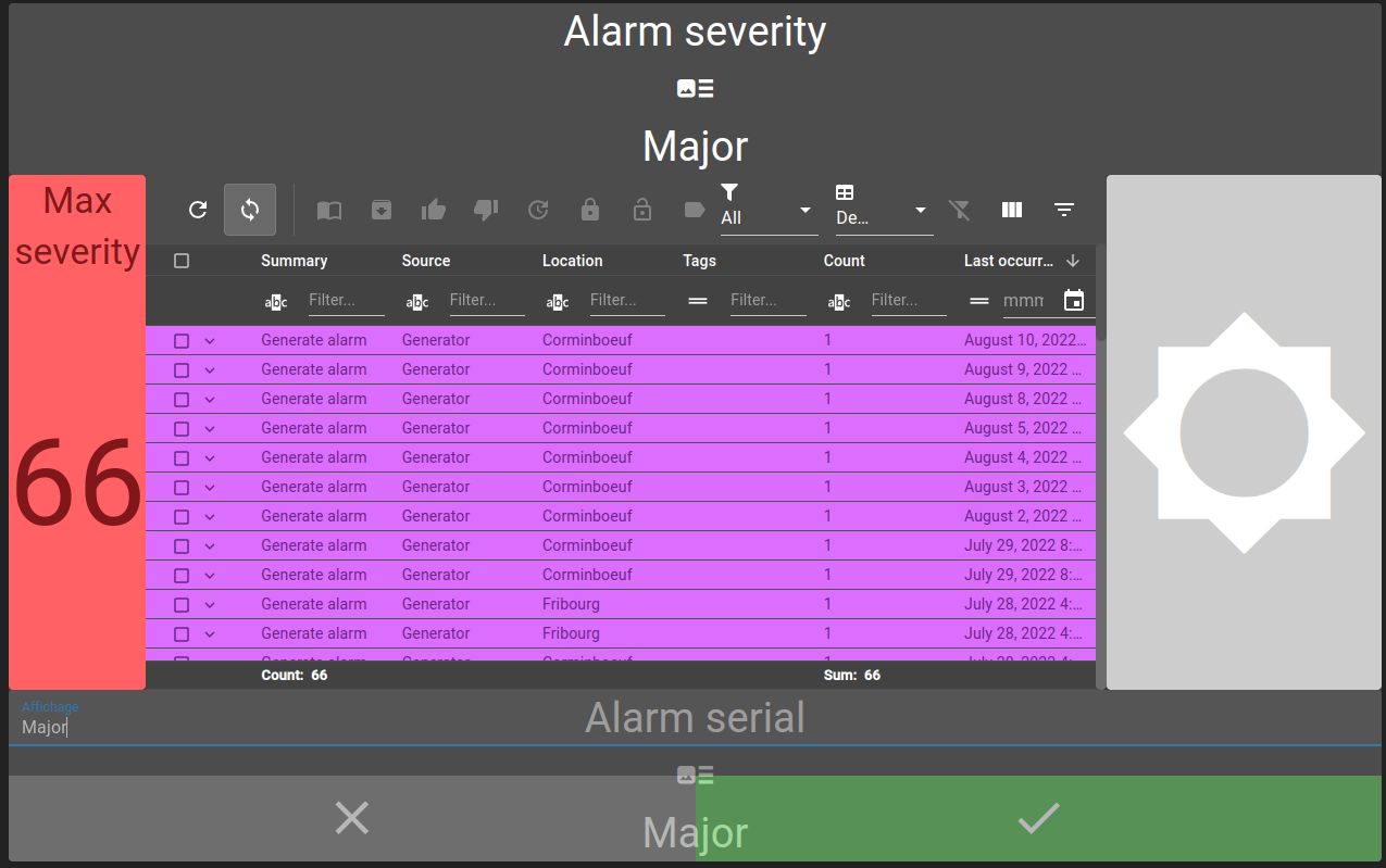
Border layouts allow you to dispose multiple widgets in a single one. You can place a widget in one of the following location :
North: top of the layout
West: left side of the layout
Center: center of the layout
East: right side of the layout
South: bottom of the layout
Example of a border layout:
Usage
The following settings can be used for defining a layout:
Setting |
Usage |
Type |
Default value |
northComponent |
North component of the layout |
Widget |
|
southComponent |
South component of the layout |
Widget |
|
centerComponent |
Center component of the layout |
Widget |
|
westComponent |
West component of the layout |
Widget |
|
eastComponent |
East component of the layout |
Widget |
|
layout |
Defines the different components width and height |
Layout (see next section) |
|
backgroundColor |
Layout background color. |
string |
Defining layout sizes
The layout parameter is required to tell the widget how its different parts should be displayed. It expects four values:
north: defines a height ratio, based on the border layout height (ex: 10% of layout => 0.1)
south: defines a height ratio, based on the border layout height (ex: 10% of layout => 0.1)
west: defines a width ratio, based on the border layout width (ex: 10% of layout => 0.1)
east: defines a width ratio, based on the border layout width (ex: 10% of layout => 0.1)
The place taken by the center component is calculated automatically.
Example of layout parameter:
{
    "layout": {
        "north": {
            "height": 0.2
        },
        "south": {
            "height": 0.2
        },
        "west": {
            "width": 0.1
        },
        "east": {
            "width": 0.1
        }
}
In this example, the north and south component each take 20% of the height and the west and east each take 10% of the width.
Defining components
To define a component, you can simply define another widget :
{
  "centerComponent": {
    "type": "AlarmTable",
    "id": "id",
    "title": "",
    "menu": "root.alarms.menus",
    "alarmWidgetSettings": {
    }
  }
}