Theme overriding
We support experimental theme overriding. This feature has no dispatcher validation and should be used with good understanding of underlying Material UI customization (see default theme viewer for all overridable parameters).
To extend current OnSphere theme, you can provide in the following content in stack.cfg file:
{
    "experimentalThemeOverride": {
        "all": {},
        "dark": {},
        "light": {}
    }
}
With the following example configuration, you will be able to achieve light and dark theme override:
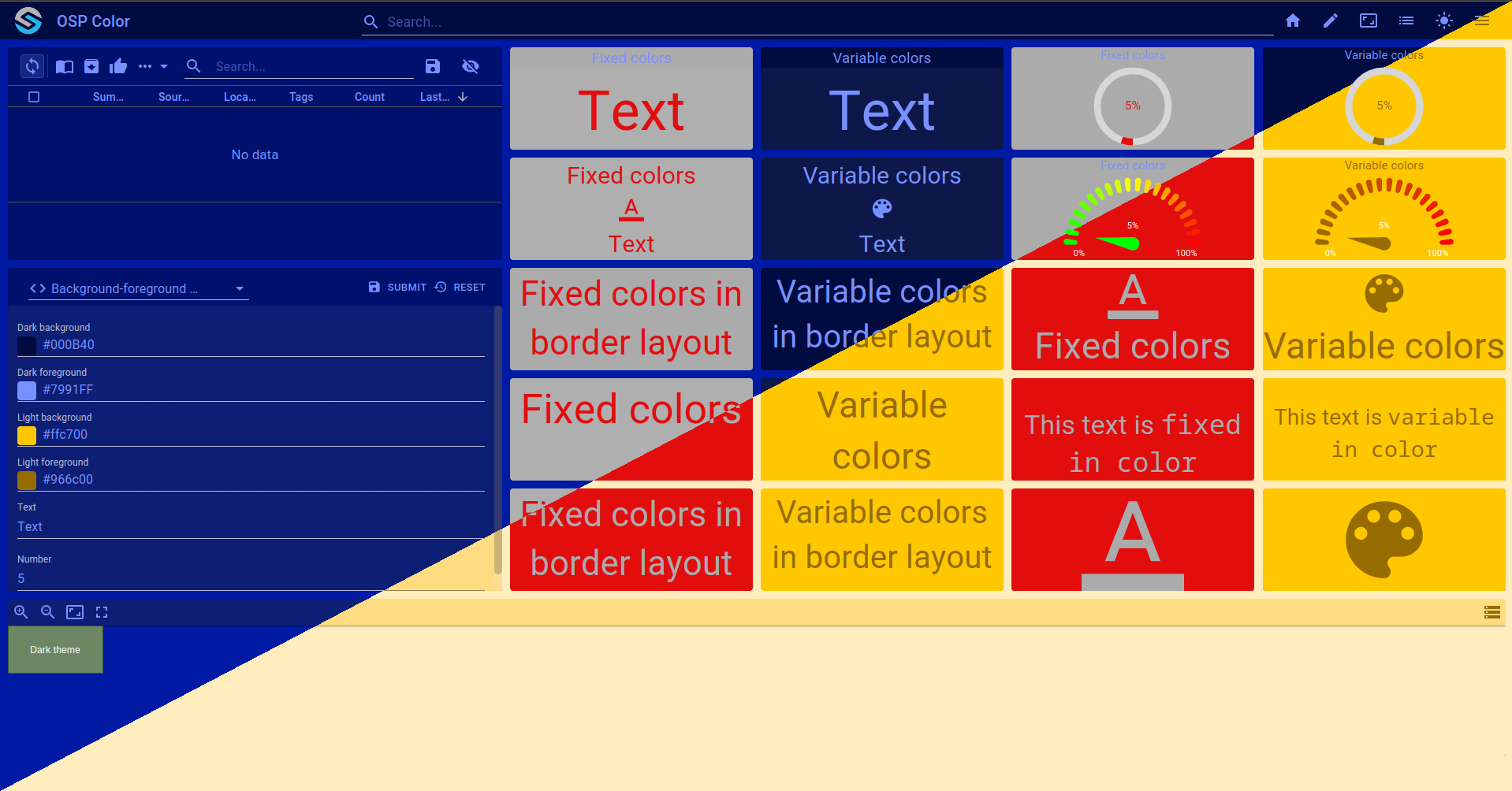
Note
The complete configuration can be checked out with git checkout origin/example-dashboard-experimental-theme-override .
{
    "moduleId": [
        "modules.keycloak.keycloak-1",
        "modules.web.web-1",
        "modules.configuration-dispatcher.main"
    ],
    "theme": {
        "mode": "dark",
        "modeIsLocked": false,
        "logoWithoutText": "",
        "logoWithText": "",
        "background": "",
        "favicon": "",
        "experimentalThemeOverride": {
            "all": {},
            "dark": {
                "palette": {
                    "background": {
                        "default": "#001aa4",
                        "paper": "#00116d"
                    },
                    "primary": {"main": "#7991FF"},
                    "secondary": {"main": "#002EFF"},
                    "text": {
                        "primary": "#7991FF"
                    }
                },
                "components": {
                    "MuiAppBar": {
                        "styleOverrides": {
                            "root": {
                                "backgroundColor": "#000B40",
                                "color": "#7991FF"
                            }
                        }
                    },
                    "MuiButton": {
                        "styleOverrides": {
                            "root": {
                                "color": "#7991FF"
                            }
                        }
                    },
                    "MuiSvgIcon": {
                        "styleOverrides": {
                            "root": {
                                "color": "#7991FF"
                            }
                        }
                    },
                    "MuiIcon": {
                        "styleOverrides": {
                            "root": {
                                "color": "#7991FF"
                            }
                        }
                    }
                }
            },
            "light": {
                "palette": {
                    "background": {
                        "default": "#ffedbe",
                        "paper": "#ffdc82"
                    },
                    "primary": {"main": "#966c00"},
                    "secondary": {"main": "#ffcc4a"},
                    "text": {
                        "primary": "#966c00"
                    }
                },
                "components": {
                    "MuiAppBar": {
                        "styleOverrides": {
                            "root": {
                                "backgroundColor": "#ffc700",
                                "color": "#966c00"
                            }
                        }
                    },
                    "MuiButton": {
                        "styleOverrides": {
                            "root": {
                                "color": "#966c00"
                            }
                        }
                    },
                    "MuiIcon": {
                        "styleOverrides": {
                            "root": {
                                "color": "#966c00"
                            }
                        }
                    },
                    "MuiSvgIcon": {
                        "styleOverrides": {
                            "root": {
                                "color": "#966c00"
                            }
                        }
                    }
                }
            }
        }
    }
}